Note: Details and visuals are anonymised to comply with NDA agreements. Images are indicated where they should be placed, based on the provided PDF.
Overview
Global Peril Diagnostic (GPD) is WTW’s enterprise risk tool for assessing exposure to a wide range of threats – from natural catastrophes like flood and windstorm, to geopolitical risks such as terrorism, civil unrest, and war. It combines geospatial analytics, hazard scoring, and live event tracking to help multinational organisations make faster, more confident decisions about their property portfolios and supply chains.
My task as Lead UX Designer was to transform a technically dense, consultant-led assessment into an intuitive, self-service platform. The core deliverable was a Security & Peril Scorecard – a dashboard experience that clearly shows where the organisation is most exposed, why, and what to do next.
Setting the Scene
Before GPD, risk managers often worked from static reports or disparate systems. Scores were buried in spreadsheets, maps were cluttered, and it was hard to prioritise action. This slowed down response to unfolding events and made board-level communication inconsistent.
The challenge was to create a single, interactive view that met the needs of very different users – analysts needing precision, executives wanting at-a-glance clarity, and regional managers focused on local priorities.
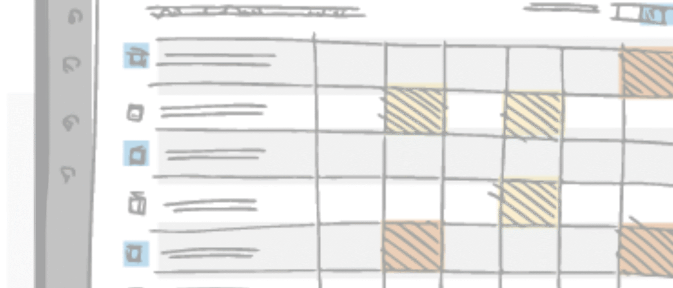
[Insert Image: Early ideas / conceptual sketches from PDF – show high-level concepts for dashboard and scorecard]
Research and Insights
I led interviews with risk analysts, security officers, and regional managers across multiple countries. We observed how they assessed risk in live scenarios, reviewed historic incident responses, and analysed support tickets for pain points.
Three key insights emerged:
- Trust and clarity drive action – Users trusted the data, but unclear prioritisation meant delays.
- One language for risk – Each peril used different scales and terminology, creating cognitive friction.
- Different views for different roles – Executives wanted a single high-level scorecard; analysts needed drill-down capability without losing context.
Information Architecture
The new structure was designed to guide the user from a global overview to the detail that matters to them:
- Global Dashboard – A scorecard with severity tiles, trend indicators, and peril filters.
- Portfolio Triage – A table-first view ranked by risk, paired with a live map for spatial context.
- Location Detail – A breakdown of hazard drivers, confidence scores, timelines, and recommended actions.
- Events Stream – Live incidents, their impact radius, and affected sites.
- Reports & Exports – Configurable, role-based views for recurring reporting.
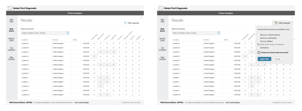
The Scorecard
The scorecard was the heart of the experience. It harmonised hazard models into a single scoring language, showing both severity and confidence. Users could filter by peril type (flood, earthquake, geopolitical) or region, then drill into the worst-affected locations.
Every score came with an inline “Why this score?” explanation, showing model inputs and data provenance. This transparency built trust and reduced the need for offline clarification.
Interaction Design
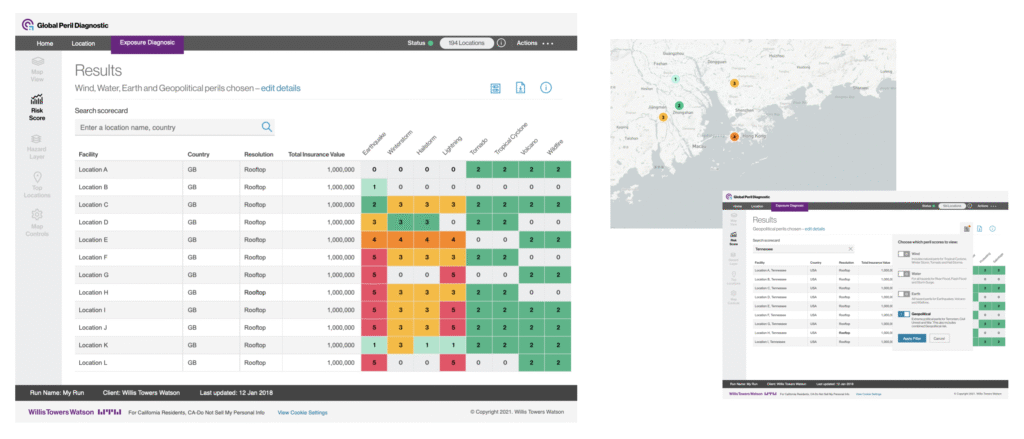
- Portfolio Table + Map – The table enabled fast scanning, sorting, and batch actions; the map offered spatial insight. Selecting a row zoomed the map to that location, maintaining orientation.
- Hazard Layers – Toggle perils on/off to reduce clutter and focus on relevant threats.
- Trend Indicators – Sparkline visuals in the scorecard tiles showed whether risk was rising or falling since the last review.
- Contextual Guidance – Recommendations were shown alongside data, making it easier to act immediately.
[Insert Image: Final design of Portfolio Triage with table + map]
Content & Accessibility
Clear, concise language was a priority. Every term was defined in plain English, and visual cues were consistent across perils to reduce cognitive switching. Accessibility features included keyboard navigation, screen reader labels for map elements, and high-contrast focus states.
Automation and AI Potential
While the initial release was focused on clarity and adoption, I mapped out future enhancements that could leverage AI:
- Risk-based recommendations – Suggest mitigation actions based on asset type and historic events.
- Predictive alerts – Forecast locations at risk based on climate scenarios or seasonal patterns.
- Smart routing – Auto-assign urgent issues to relevant teams.
- Natural-language queries – “Show all high-risk warehouses in Europe with flood exposure above 75.”
Outcomes
Post-launch, GPD’s scorecard delivered measurable improvements:
- Faster triage of risk portfolios.
- Improved stakeholder understanding of hazard drivers.
- Increased self-service usage, reducing dependency on consultants.
- Higher adoption of saved scorecard presets across regions.
[Insert Image: Before and after comparison of old reporting vs new scorecard]