Overview
As part of Jaguar Land Rover’s Modern Luxury transformation, I helped define and activate the House of Brands Digital Guidelines — a framework for applying unified design principles across four distinct brands: Range Rover, Defender, Discovery, and later Jaguar.
The goal was to bring consistency, clarity, and scalability to digital experiences while respecting each brand’s unique tone, emotion, and purpose.
The Challenge
By 2022, JLR’s digital ecosystem was fragmented:
- Each brand had its own design style, colour palette, and typography.
- Teams were re-inventing UI patterns for each website, app, and configurator.
- Brand experiences felt inconsistent across devices.
Create a unified design architecture that could flex per brand — maintaining individuality, yet operating on a shared foundation.
My Role
As a Senior UX Designer within the Digital Experience team, I:
- Helped structure and rationalise the House of Brands (HoB) digital layer.
- Collaborated with visual design and brand teams to translate Modern Luxury principles into usable digital systems.
- Defined colour, typography, and visual world guidance for each marque.
- Worked with product and OneApp teams to apply these to live UI examples and prototypes.
Approach
1. Establish the Core Foundation
We started with the Modern Luxury Core Identity — monochromatic, reductive, and elegant.
This core defined the shared layer:
- Typography, buttons, and global components.
- Accessible colour contrast (AA/AAA).
- Common architecture for websites, apps, and configurators.
2. Define Brand Layers
Each brand required its own emotional territory while adhering to the shared UX structure.
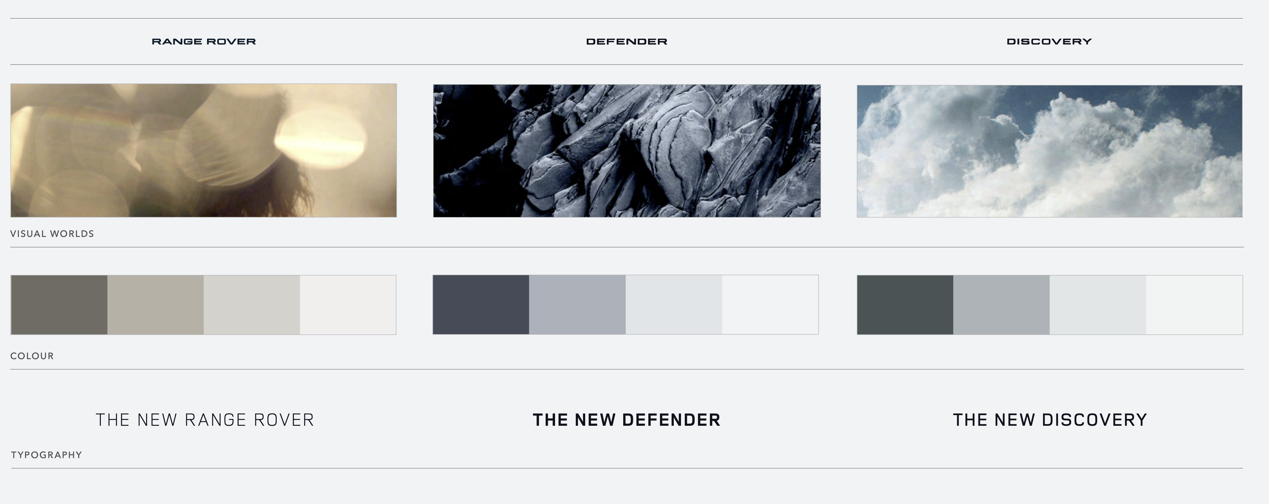
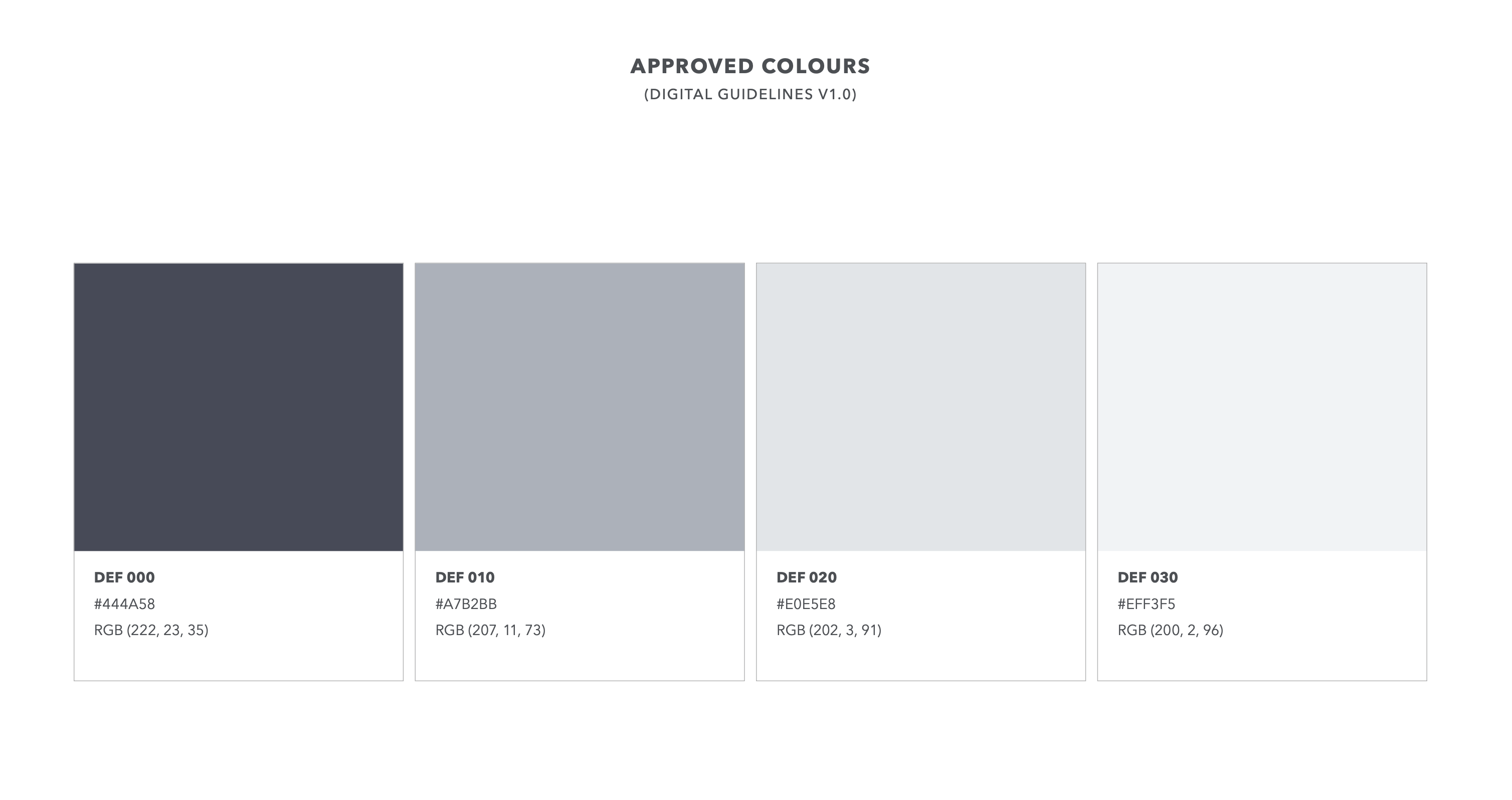
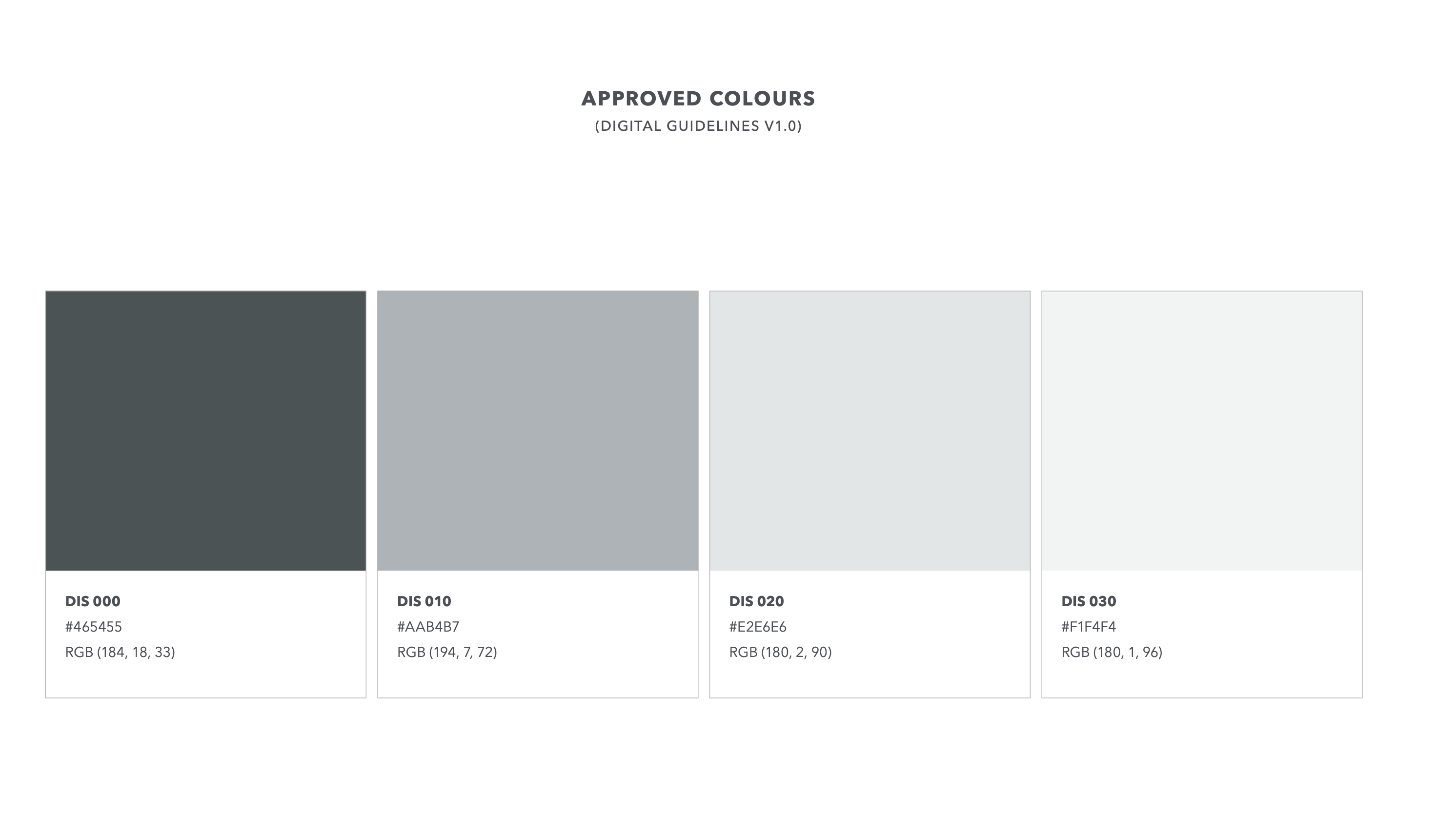
We mapped out Visual Worlds, Colour Palettes, and Typography Weights per marque:
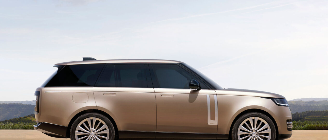
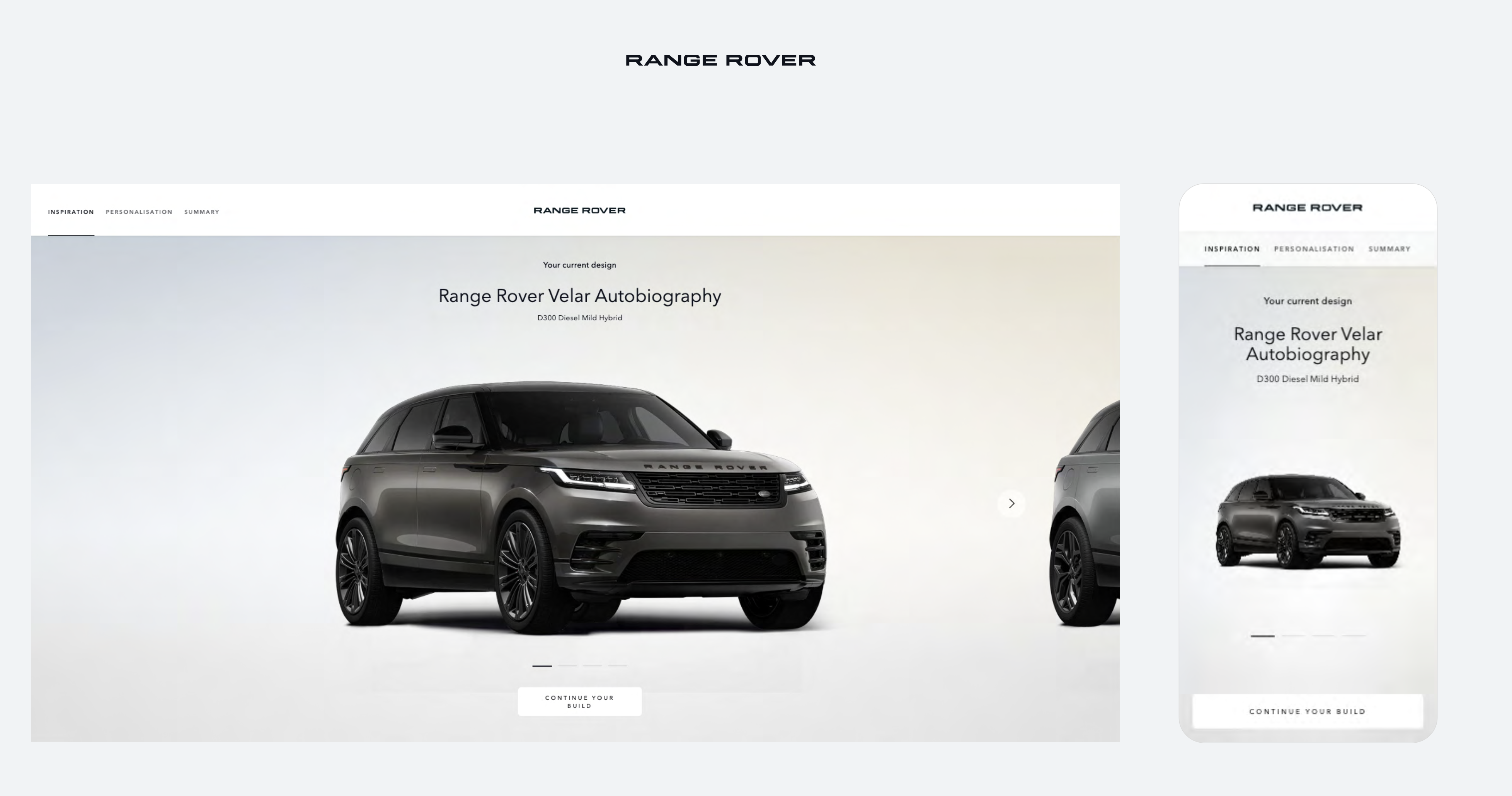
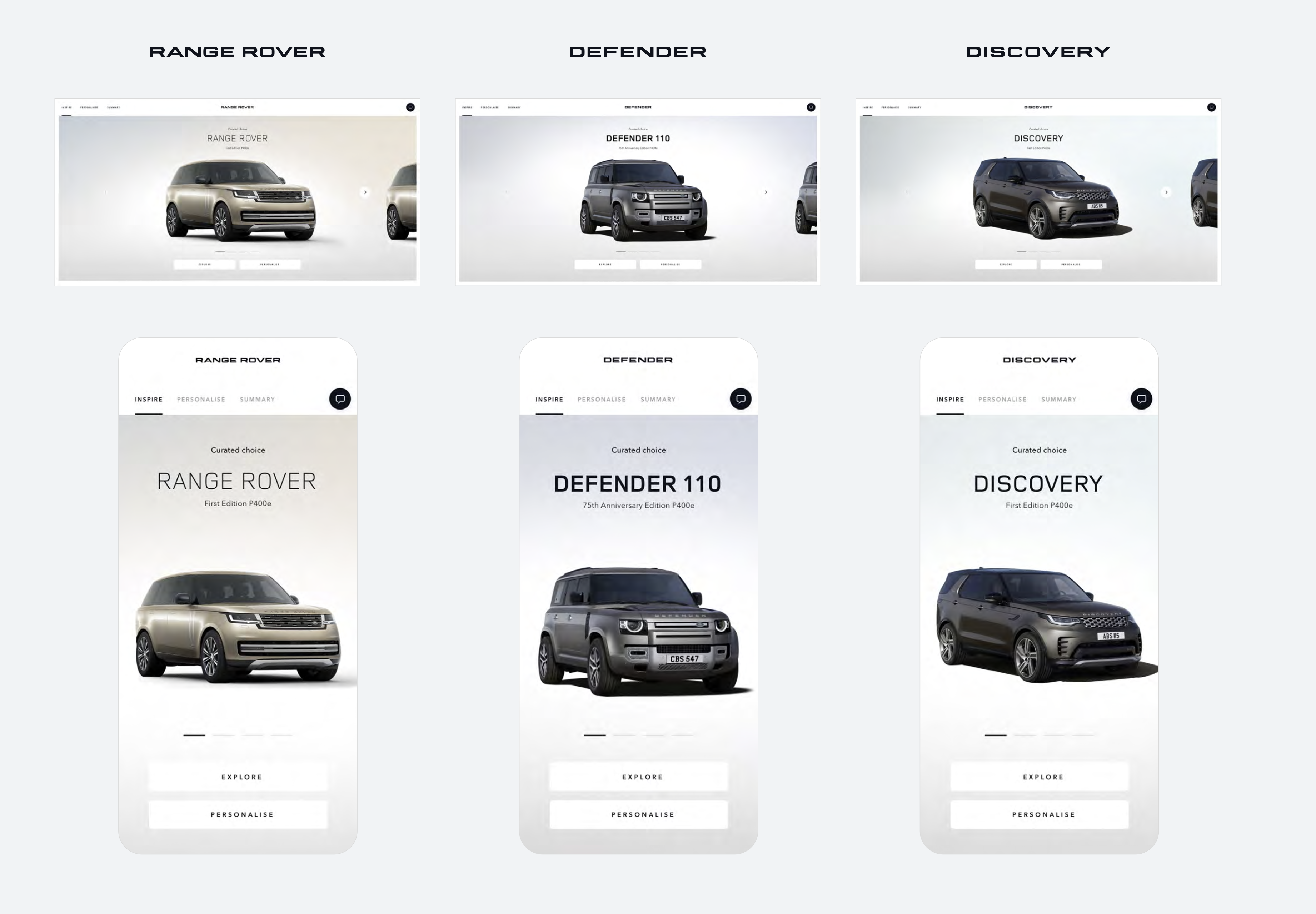
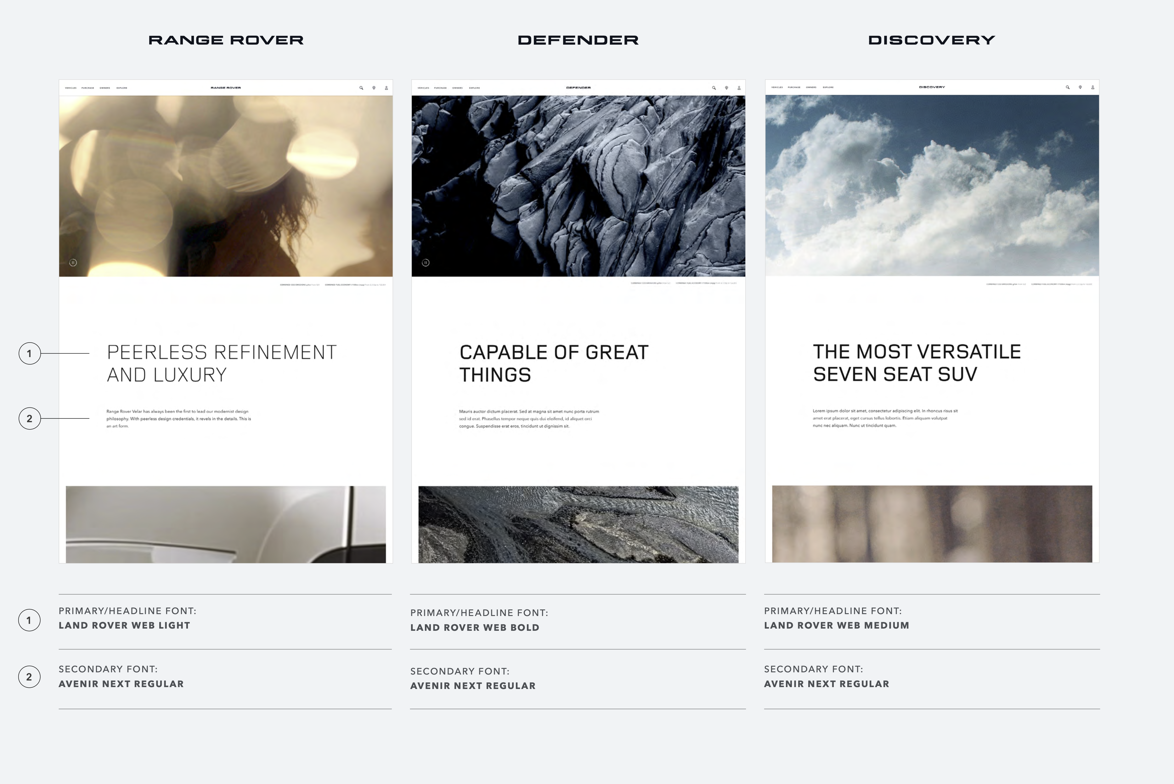
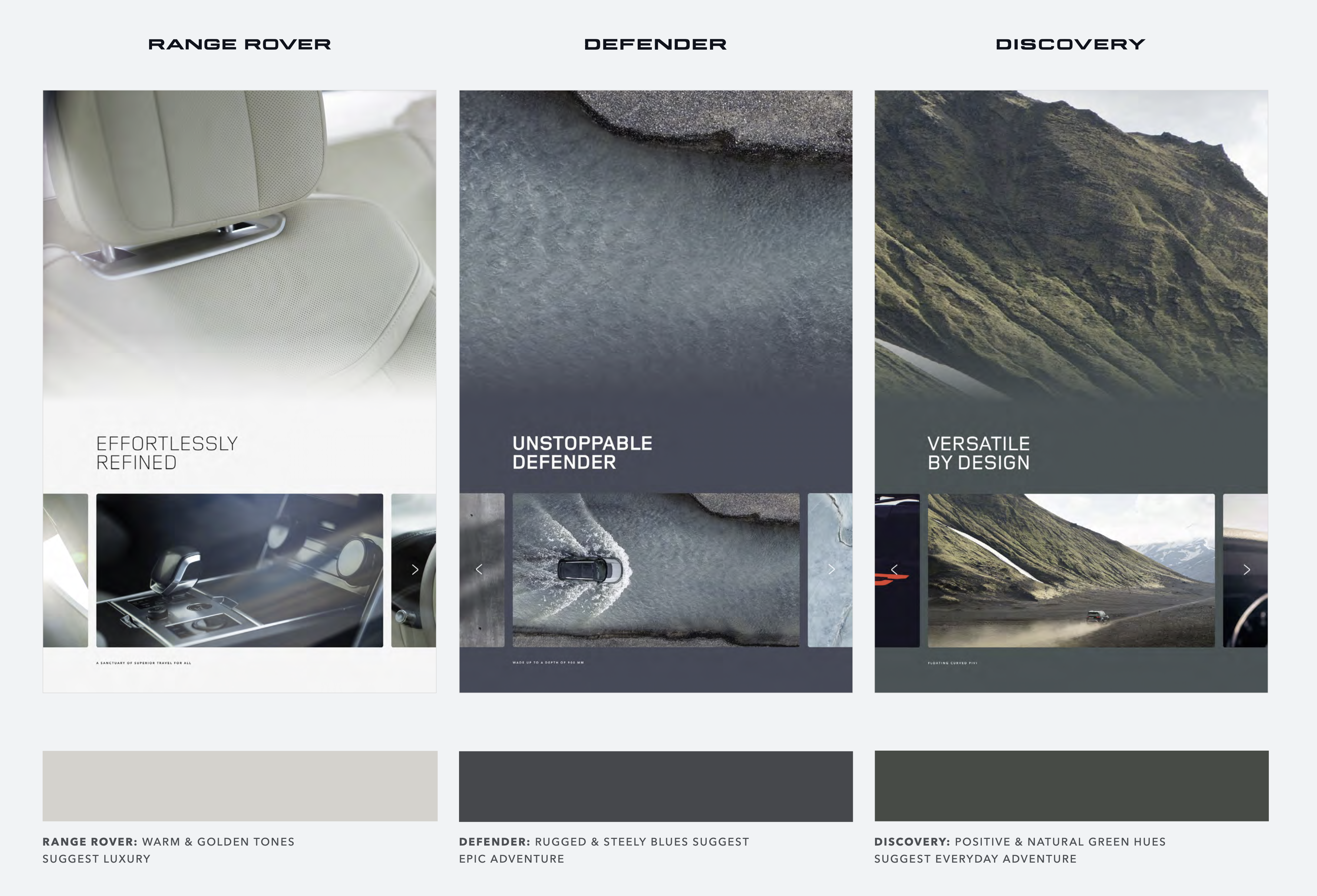
Range Rover
- Personality: Elevated, warm, and luxurious
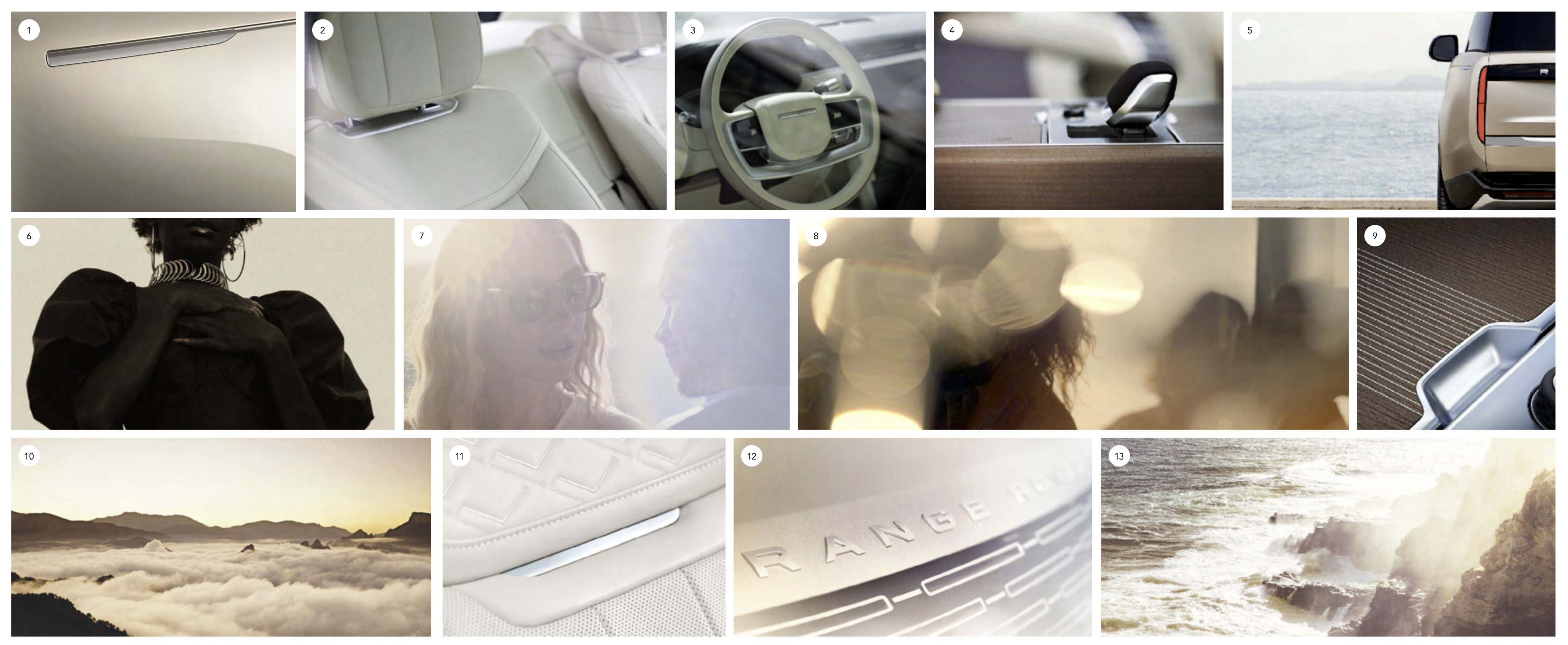
- Visual World: Cinematic with golden light and calm compositions
- Colour Direction: Gold and neutral tones
- Typography Weight: Land Rover Web Light
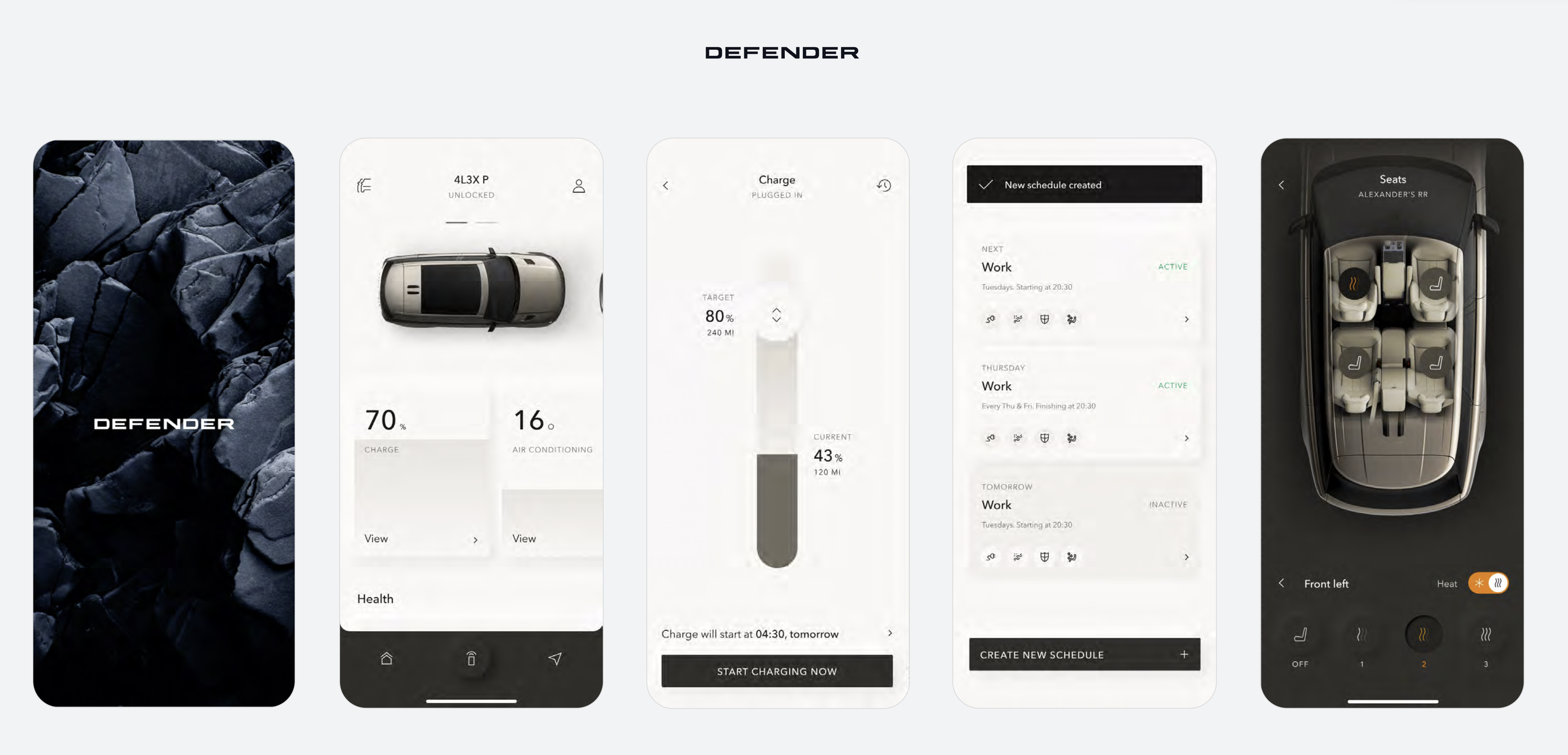
Defender
- Personality: Purposeful, confident, and bold
- Visual World: Expansive landscapes, rugged texture, human grit
- Colour Direction: Steely blues and greys
- Typography Weight: Land Rover Web Bold
Discovery
- Personality: Human, adventurous, and optimistic
- Visual World: Family moments, natural light, spontaneity
- Colour Direction: Earthy greens and soft neutrals
- Typography Weight: Land Rover Web Medium
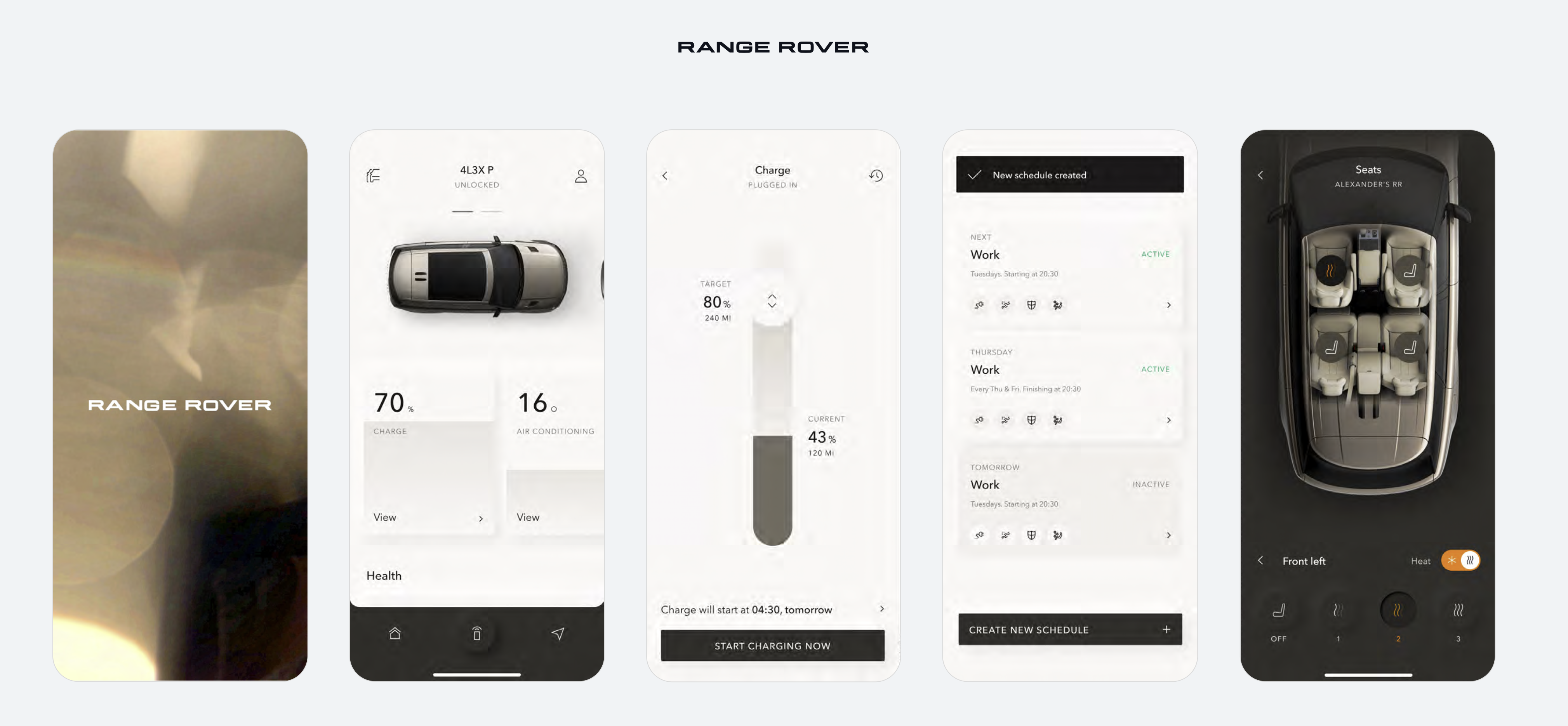
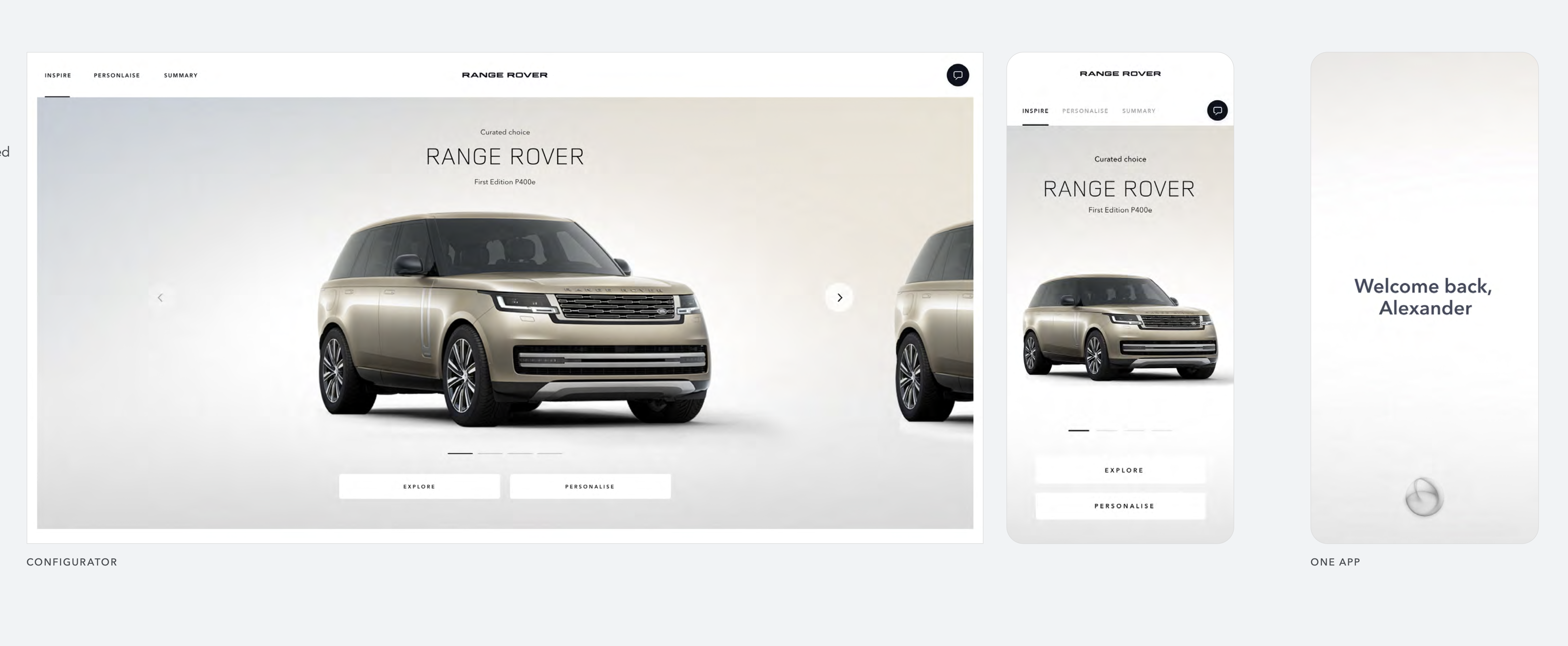
3. Apply to Real Products
To prove scalability, we extended the guidelines into key digital experiences:
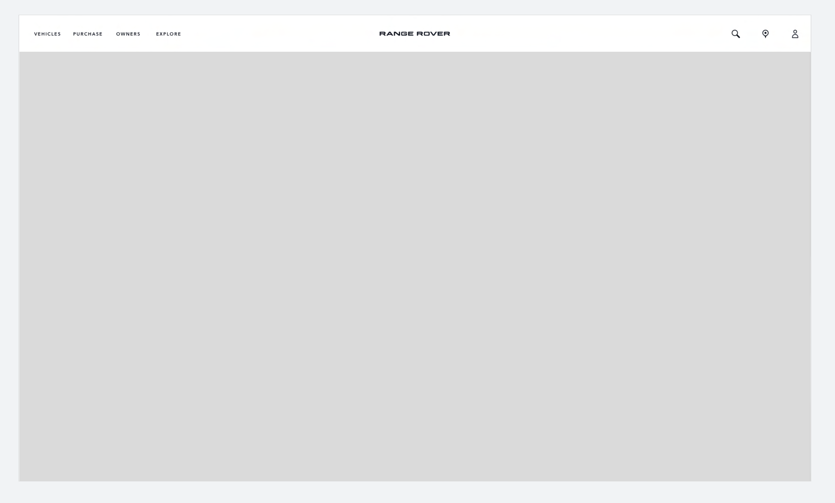
- Websites — consistent navigation and footer.
- Configurator — unified typography and gradients.
- OneApp — monochrome structure, brand colour accents.
Each product used the same design DNA, but brand-specific assets (imagery, type weight, gradient tone) to cue individuality.
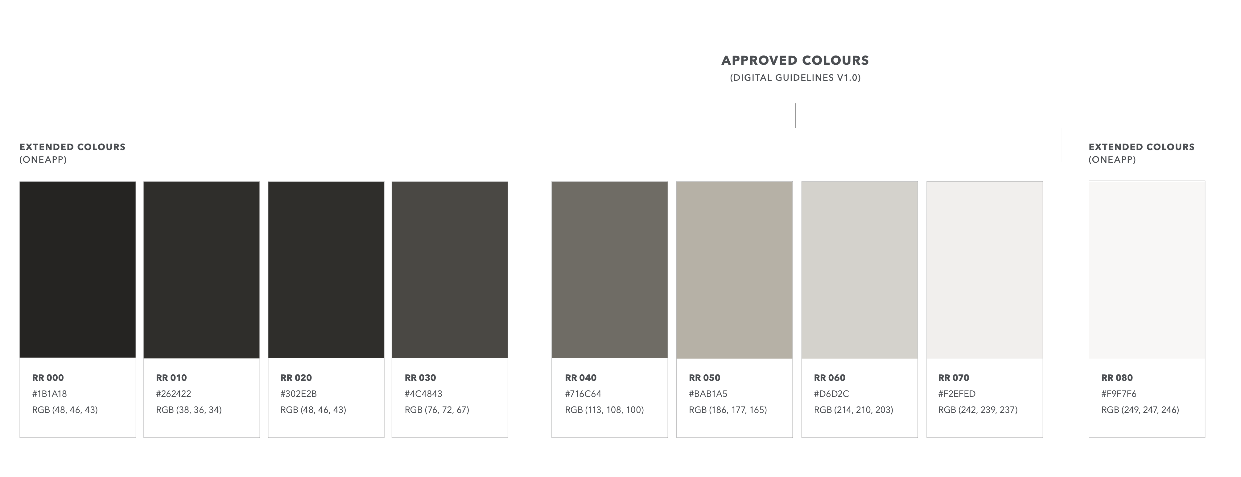
4. Create Scalable Rules
To maintain consistency, I helped establish practical specifications for developers and designers:
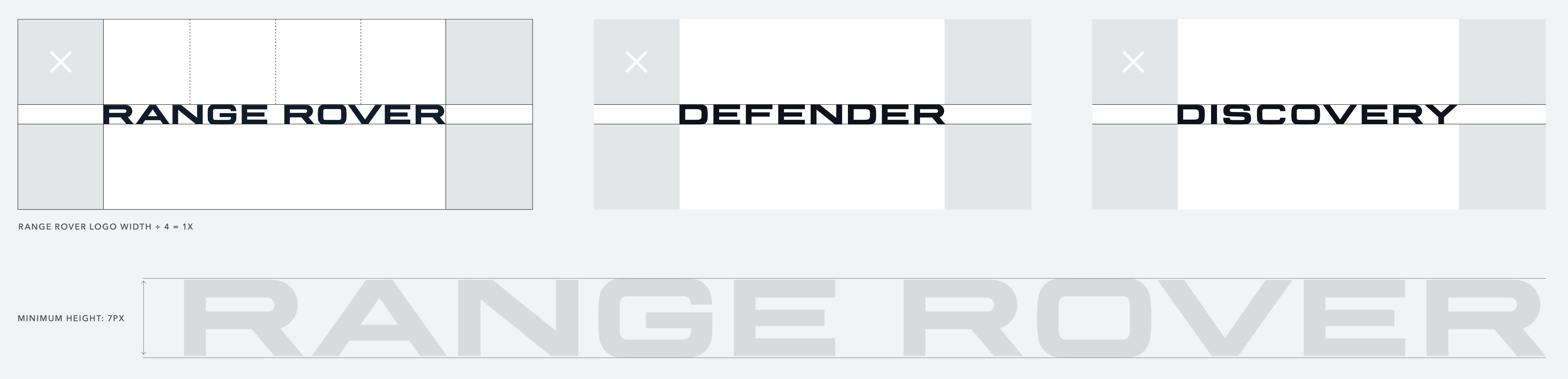
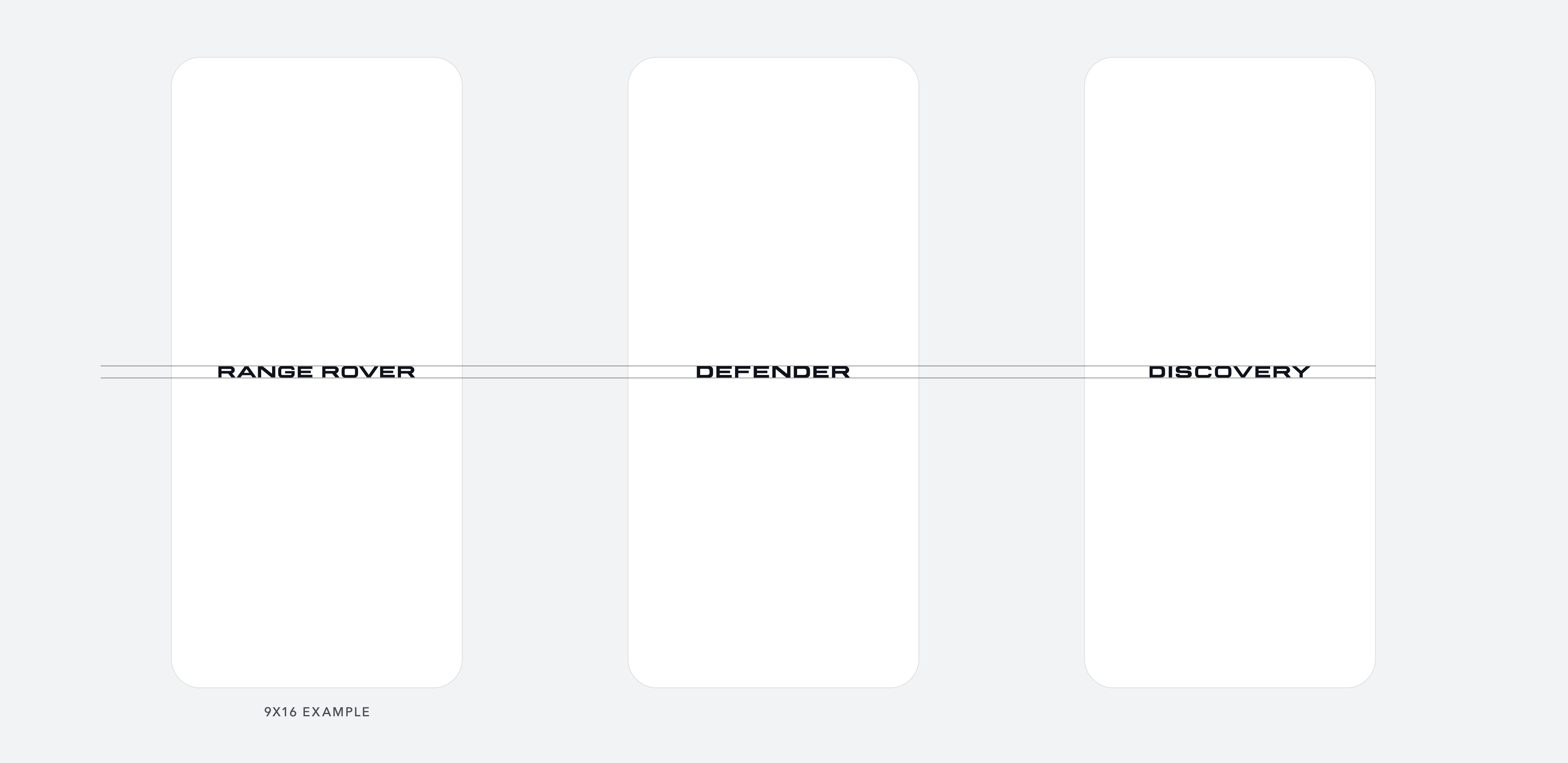
These ensured that internal and vendor teams could apply the system independently and correctly.
5. Document and Communicate
We consolidated everything into the HoB Digital Guidelines V2.
I contributed to:
- Layout and structure of the guidelines PDF.
- Creation of image grids and colour palettes.
- Liaising with stakeholders to align on final hierarchy and content order.
- Preparing ZeroHeight documentation for developer rollout.
Outcomes
- Unified Digital System: Four brands now share a consistent digital architecture.
- Faster Delivery: Common components reduced duplication and handover time.
- Accessible by Design: Monochrome core ensured WCAG 2.1 AA legibility.
- Brand Flexibility: Each marque maintained distinct identity through colour, tone, and motion.
- Scalable Future: Guidelines expanded into Future Applications for next-gen web and app rollouts.
Reflection
This project demonstrated how UX design systems can express brand emotion without sacrificing structure or accessibility.
The challenge was balancing design purity with real-world implementation — ensuring the system worked equally well for both luxury storytelling and functional interaction.