Background & Context
Willis Towers Watson (WTW) is a global leader in risk analytics.
Their Global Peril Diagnostic (GPD) platform enables consultants and clients to evaluate exposure to natural, political, and man-made risks across portfolios — from earthquakes and floods to terrorism and supply-chain disruption.
But the product had grown complex. Different teams managed separate versions, models overlapped, and users struggled to interpret results.
What began as a powerful analytics engine had become a usability challenge.
My goal was to simplify the experience — to create clarity, consistency, and confidence across all users.
Stakeholders & Discovery
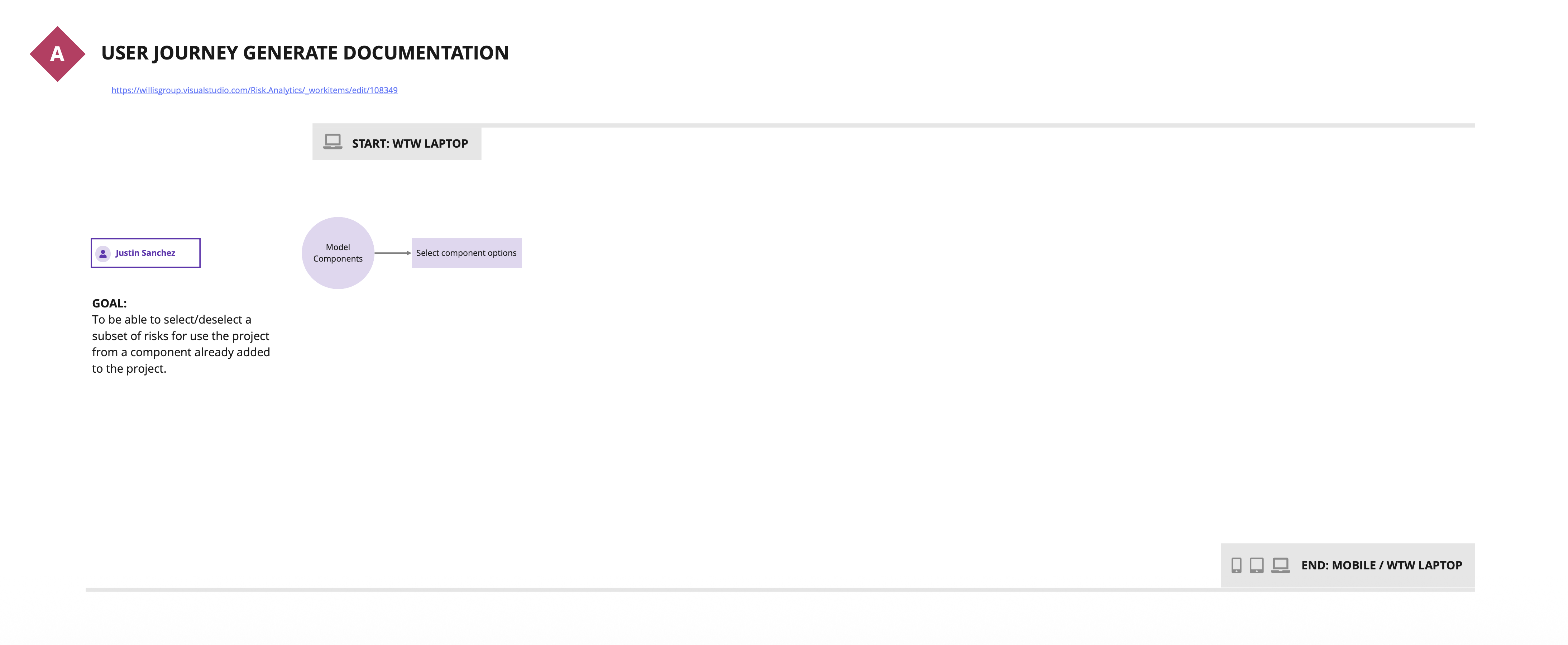
I began with deep discovery: stakeholder mapping, user interviews, and a full audit of the product ecosystem.
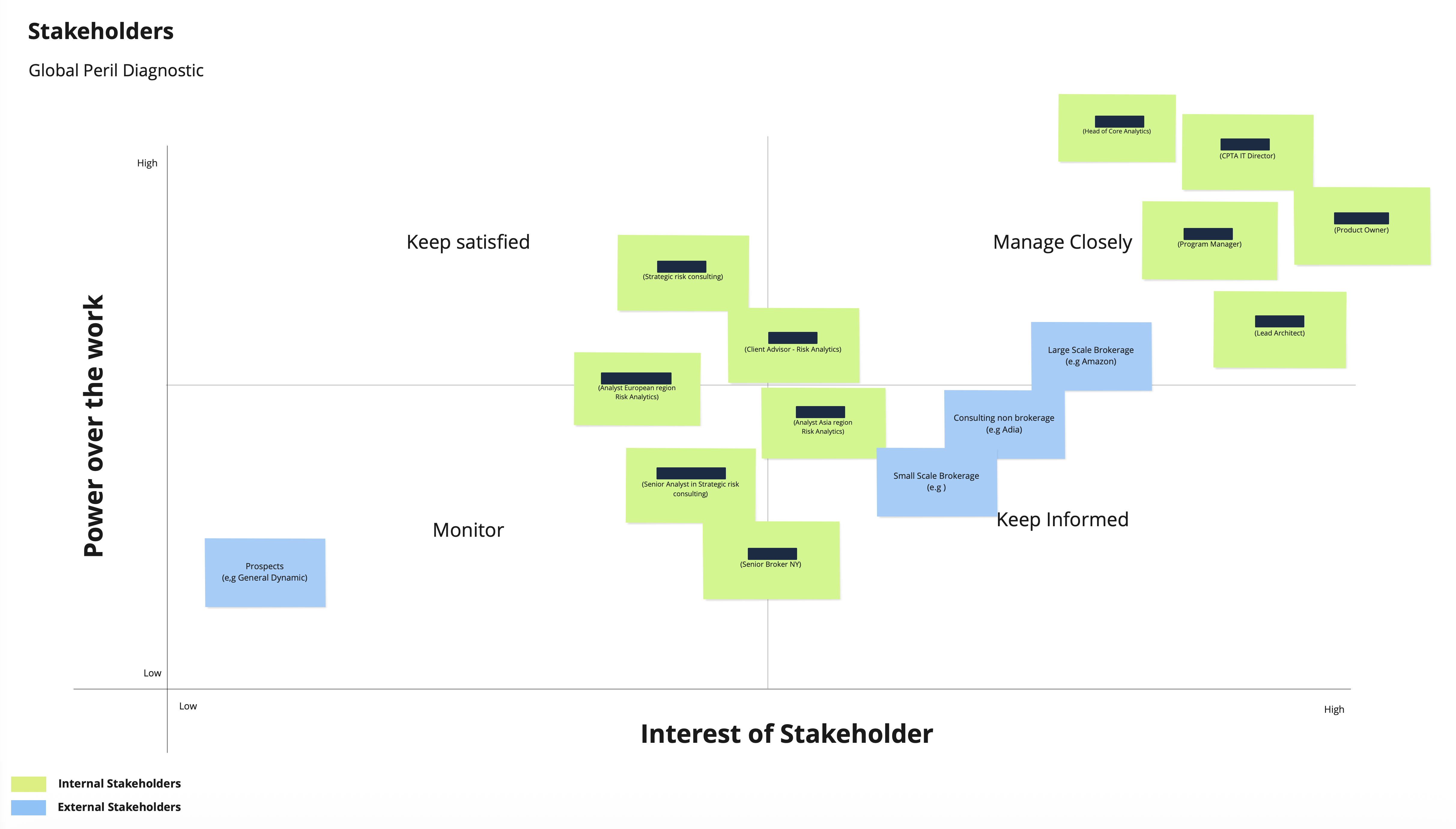
Identifying key decision makers across product, analytics, IT, and consulting teams.
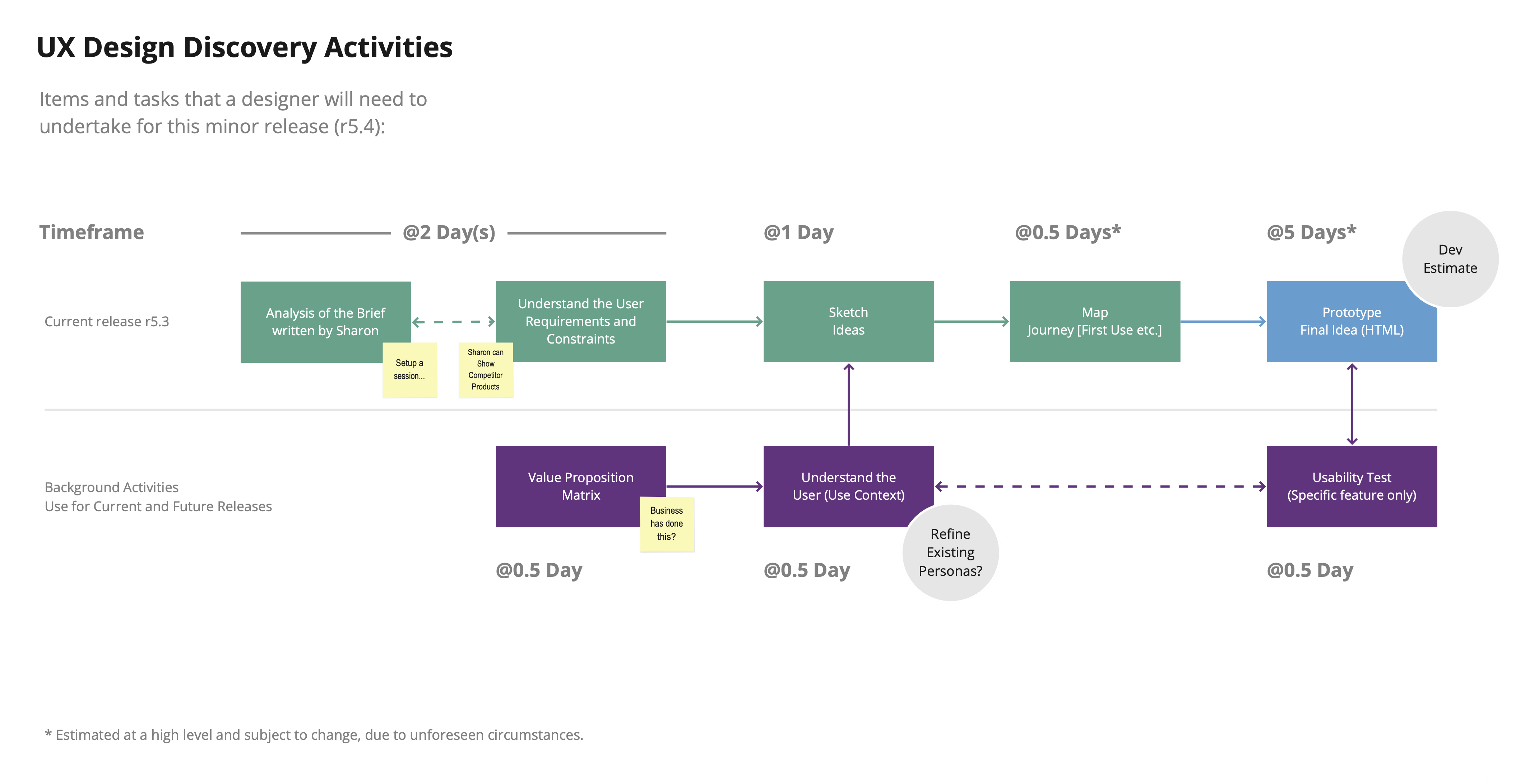
A six-day discovery plan covering stakeholder workshops, value mapping, user journey mapping, and prototype validation.
The system architecture and features were also mapped to identify technical constraints and overlaps.
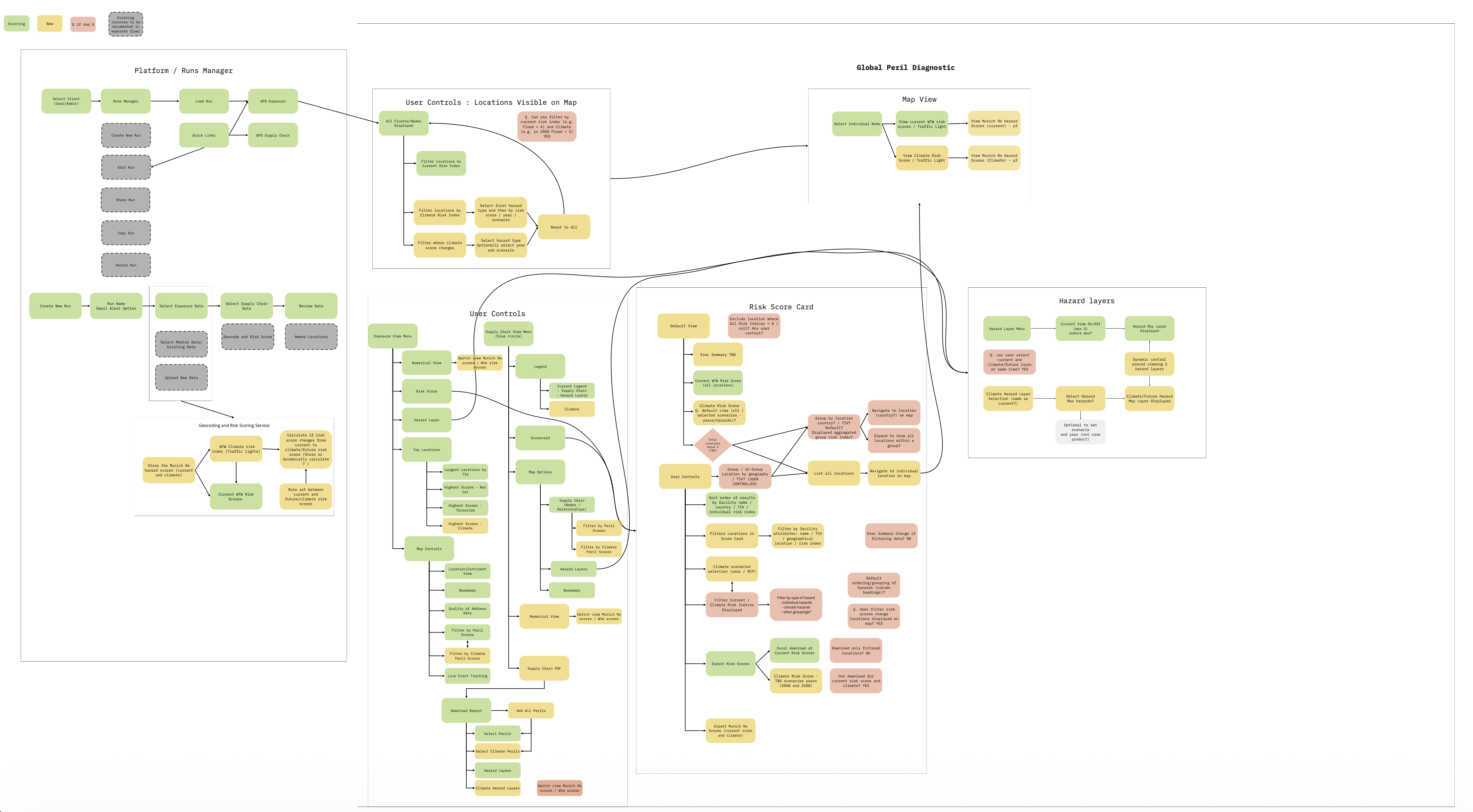
Initial landscape of GPD modules, highlighting fragmentation and duplication across data layers.
The Challenge
The audit revealed several high-impact issues:
- Fragmented workflows – users had to jump between portals and spreadsheets.
- Inconsistent data visuals – each risk model had its own UI logic.
- Low accessibility and responsiveness – screens broke on smaller devices.
- Unclear ownership – confusion over who could share or manage runs.
- High cognitive load – too many steps to perform simple analysis.
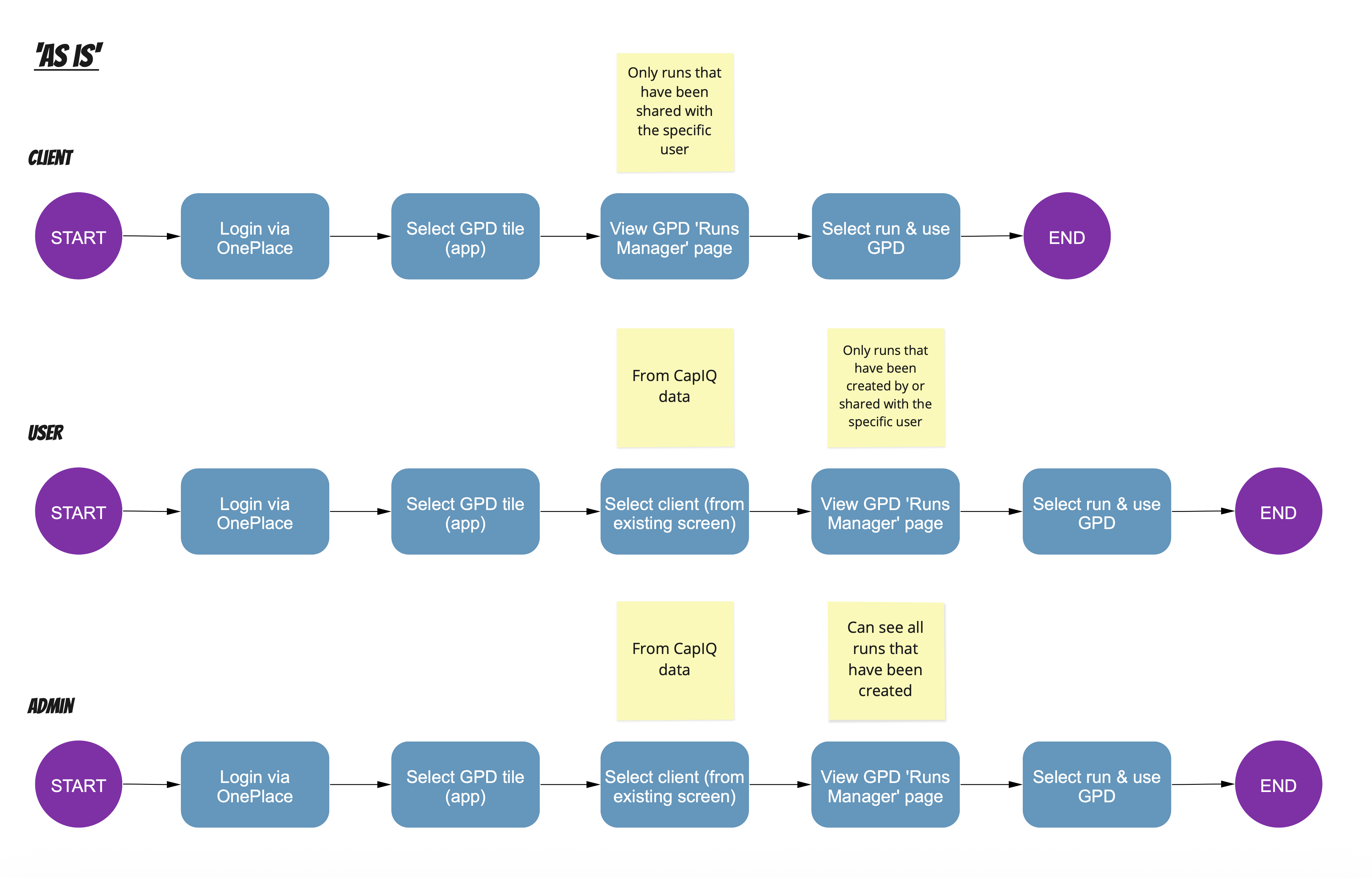
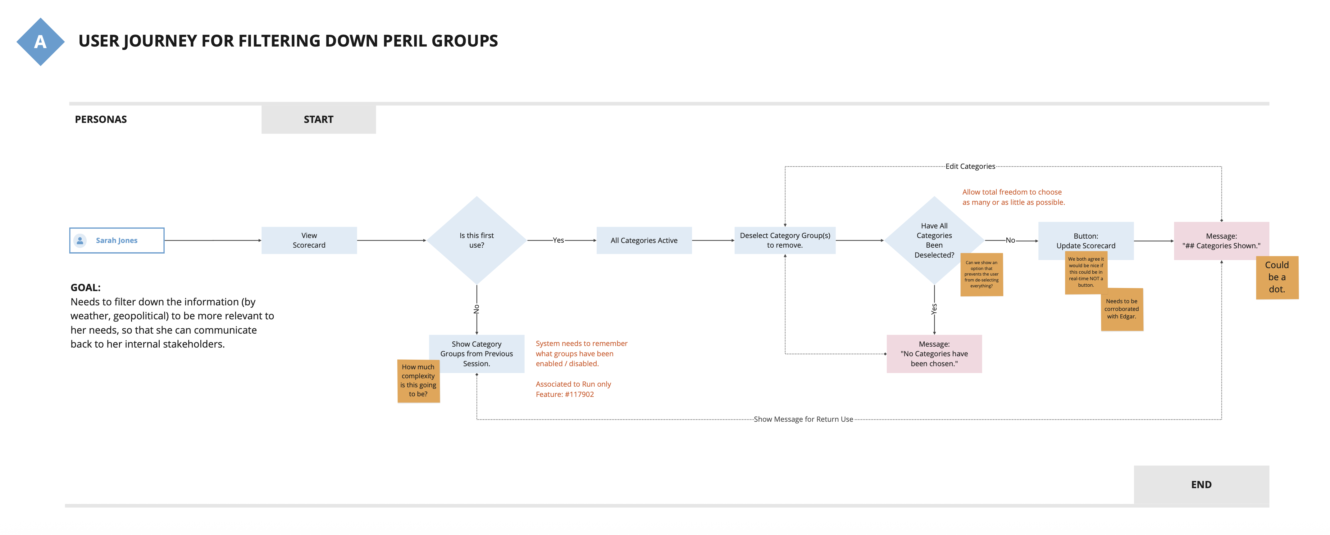
Three disconnected user flows — no shared logic, inconsistent permissions, and redundant steps.
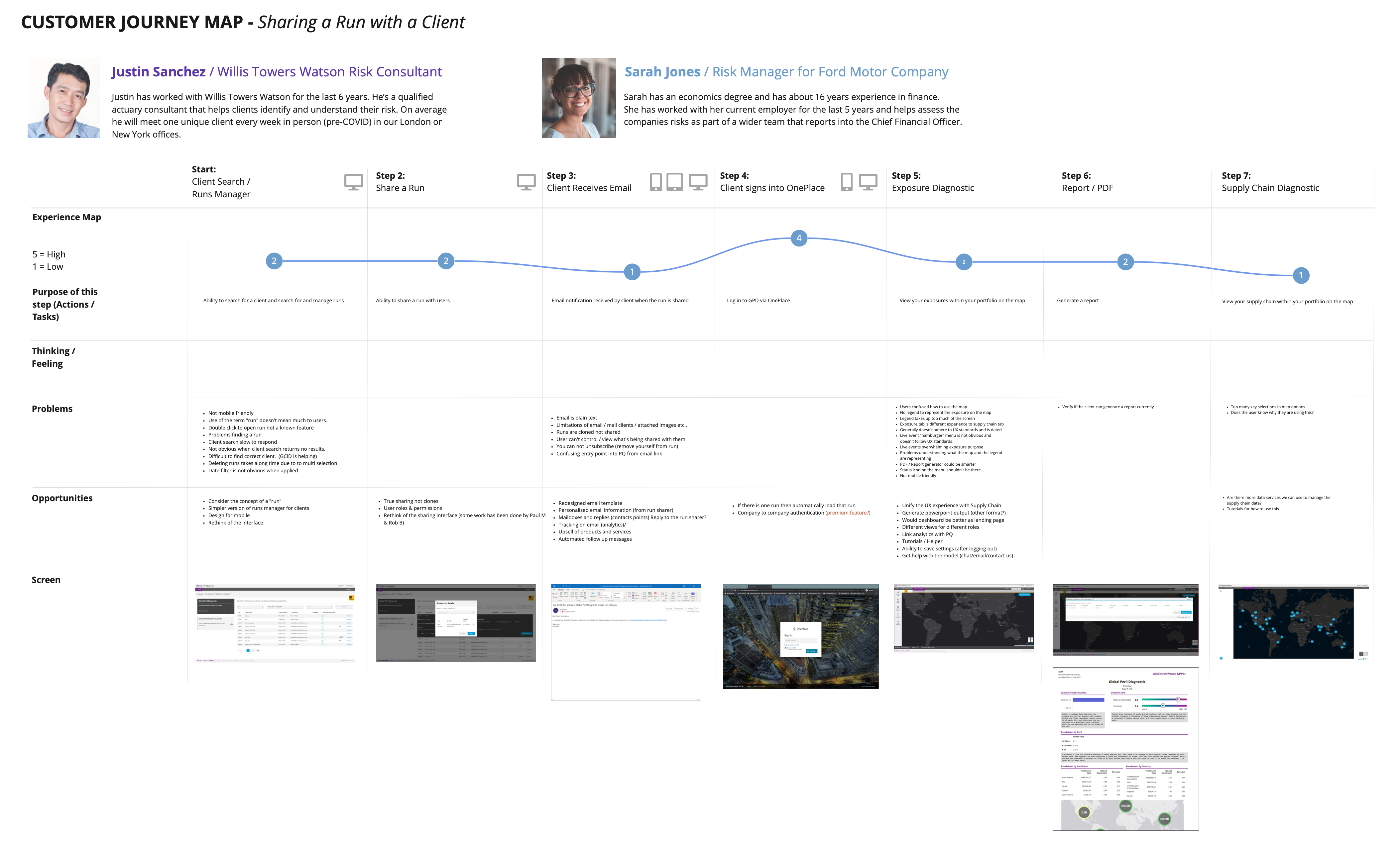
Detailed journey mapping uncovered friction during sharing, run management, and report generation.
Usability Assessment
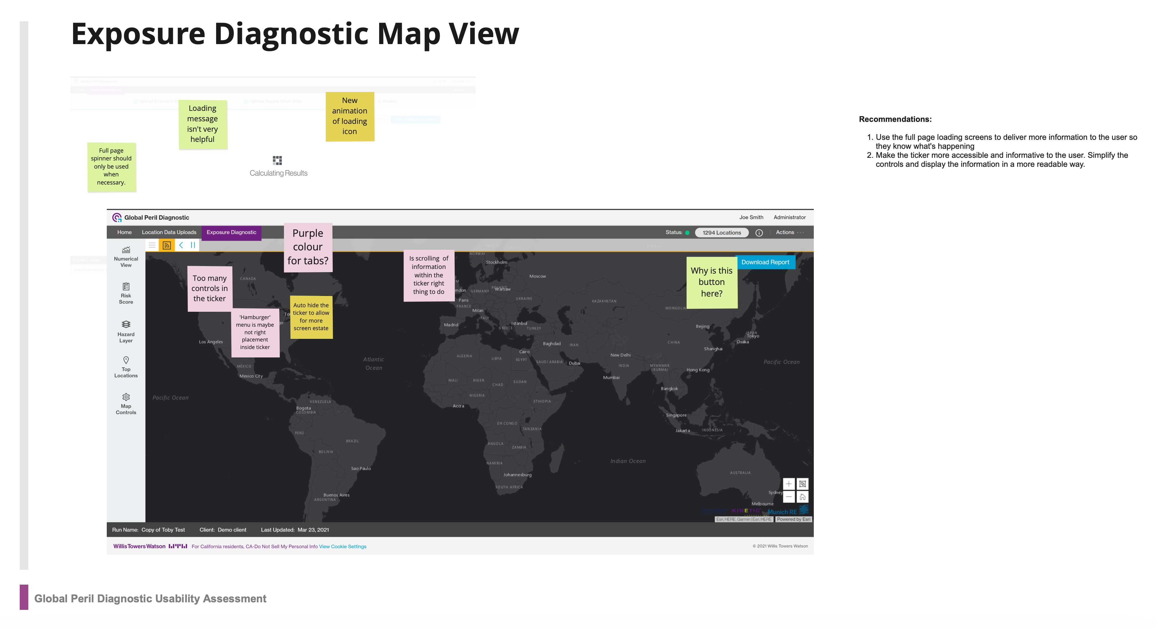
A full heuristic evaluation was performed on each module.
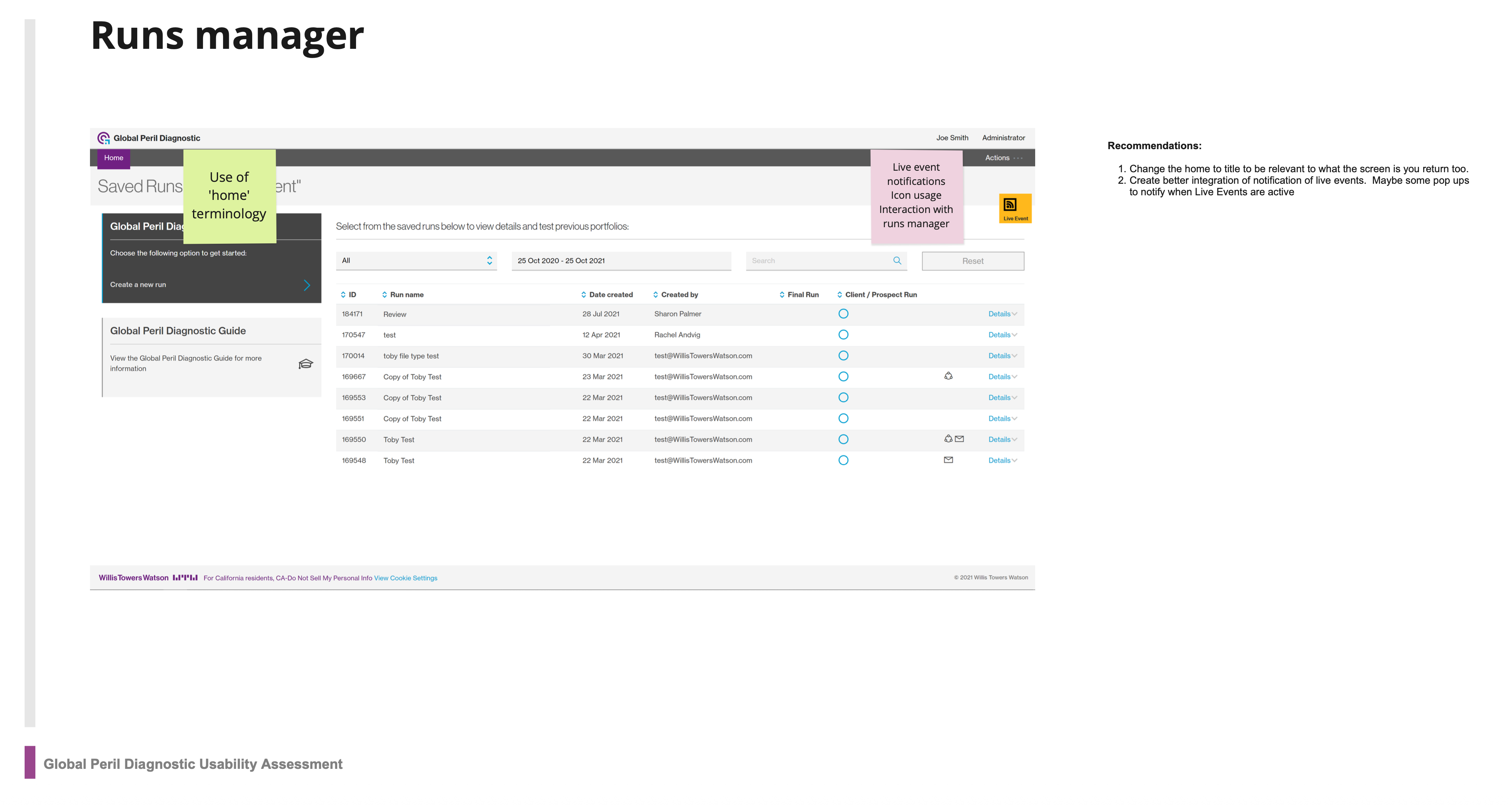
Overloaded controls, unclear feedback, and poor visibility of system status.
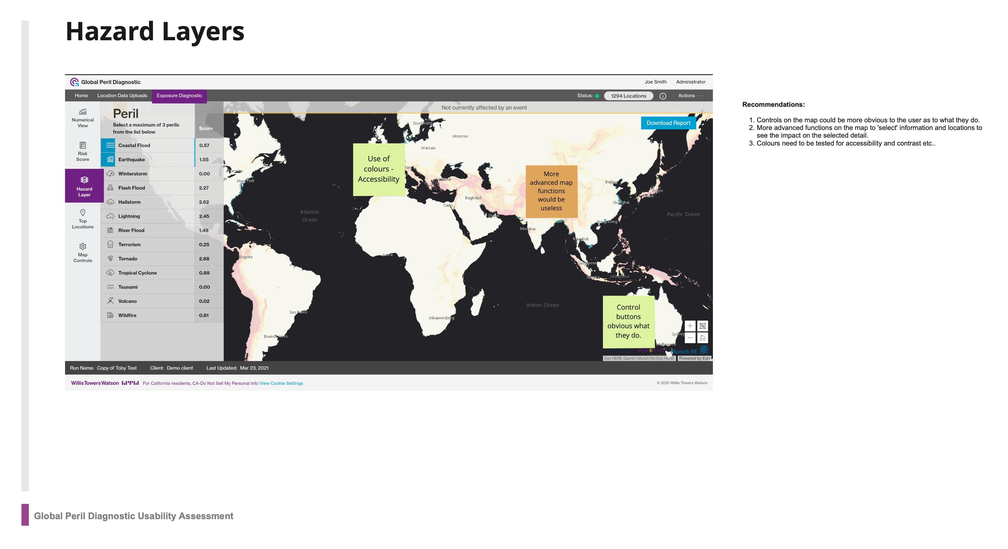
Inconsistent colour use and hidden controls hindered comprehension.
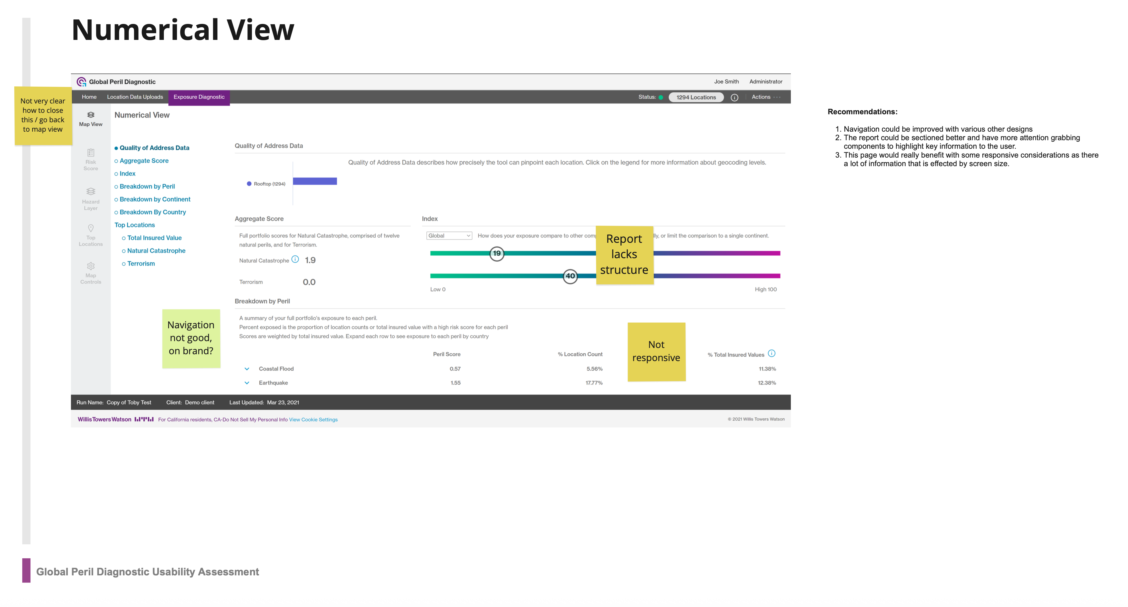
Flat hierarchy, poor navigation, and unresponsive layout for large datasets.
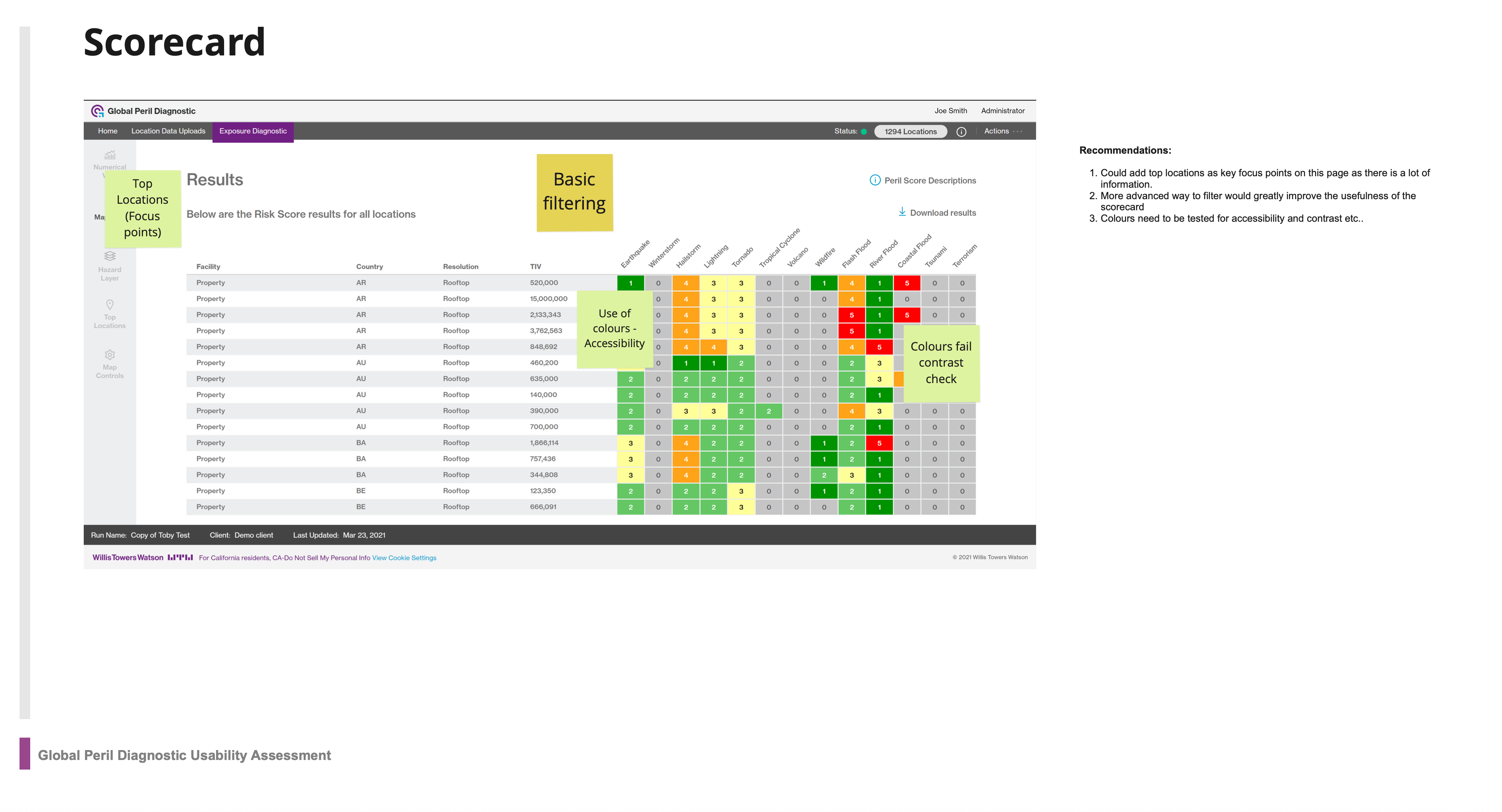
Colours failed contrast checks and filtering lacked clarity.
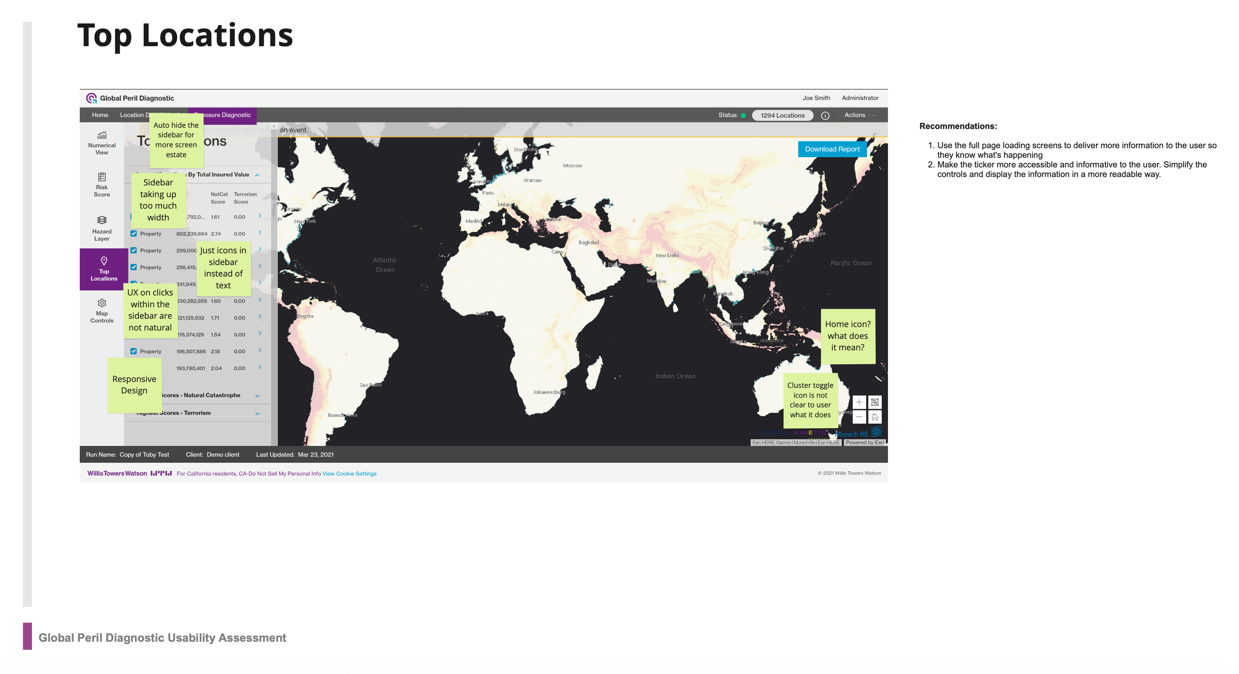
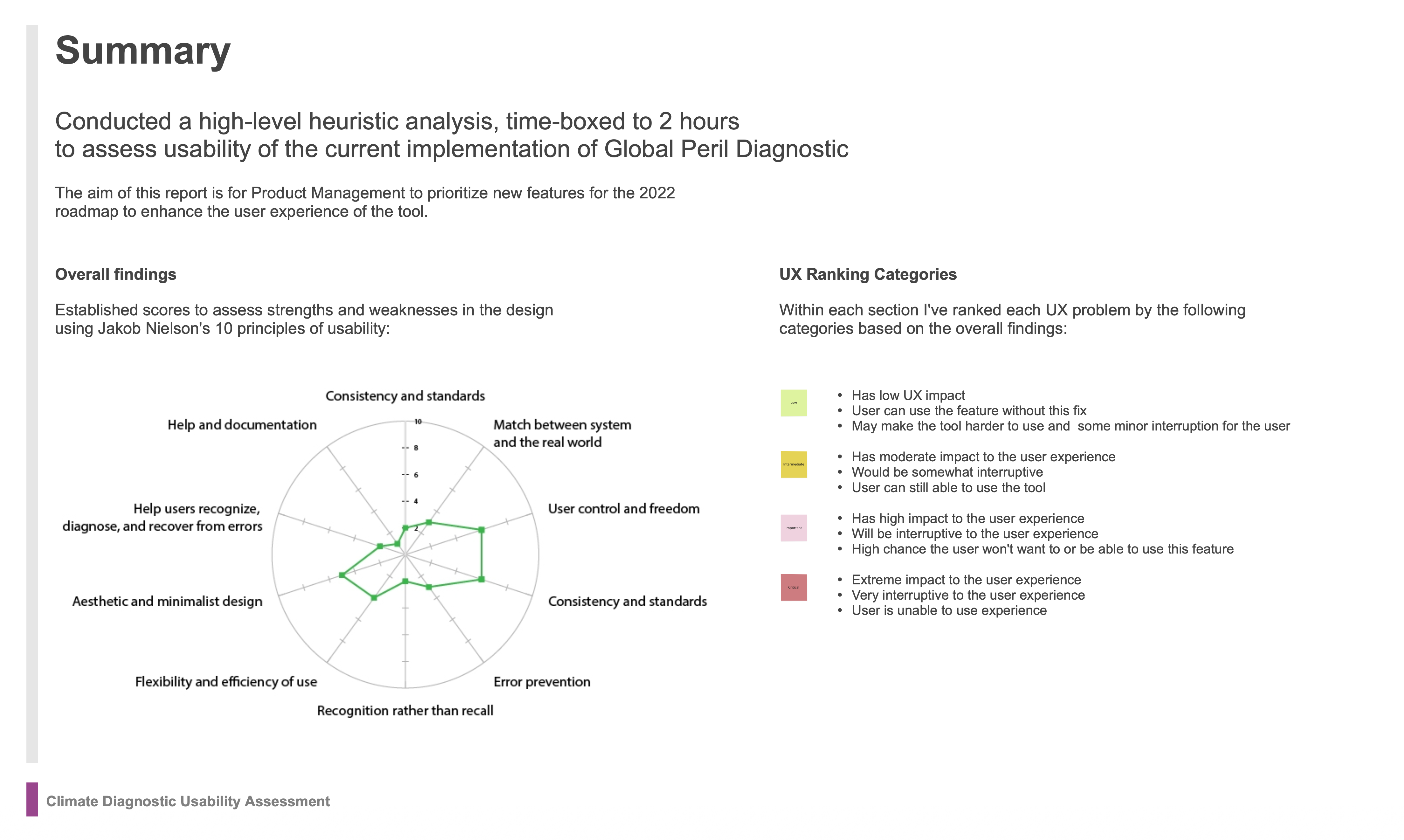
Sidebar took excessive space and iconography lacked clear meaning.
These findings became the foundation for targeted UX redesign sprints.
Process & Approach
Framing the Opportunities
To move from critique to creativity, I facilitated an ideation workshop with consultants and analysts.
Turning problem statements into actionable “How might we…” questions.
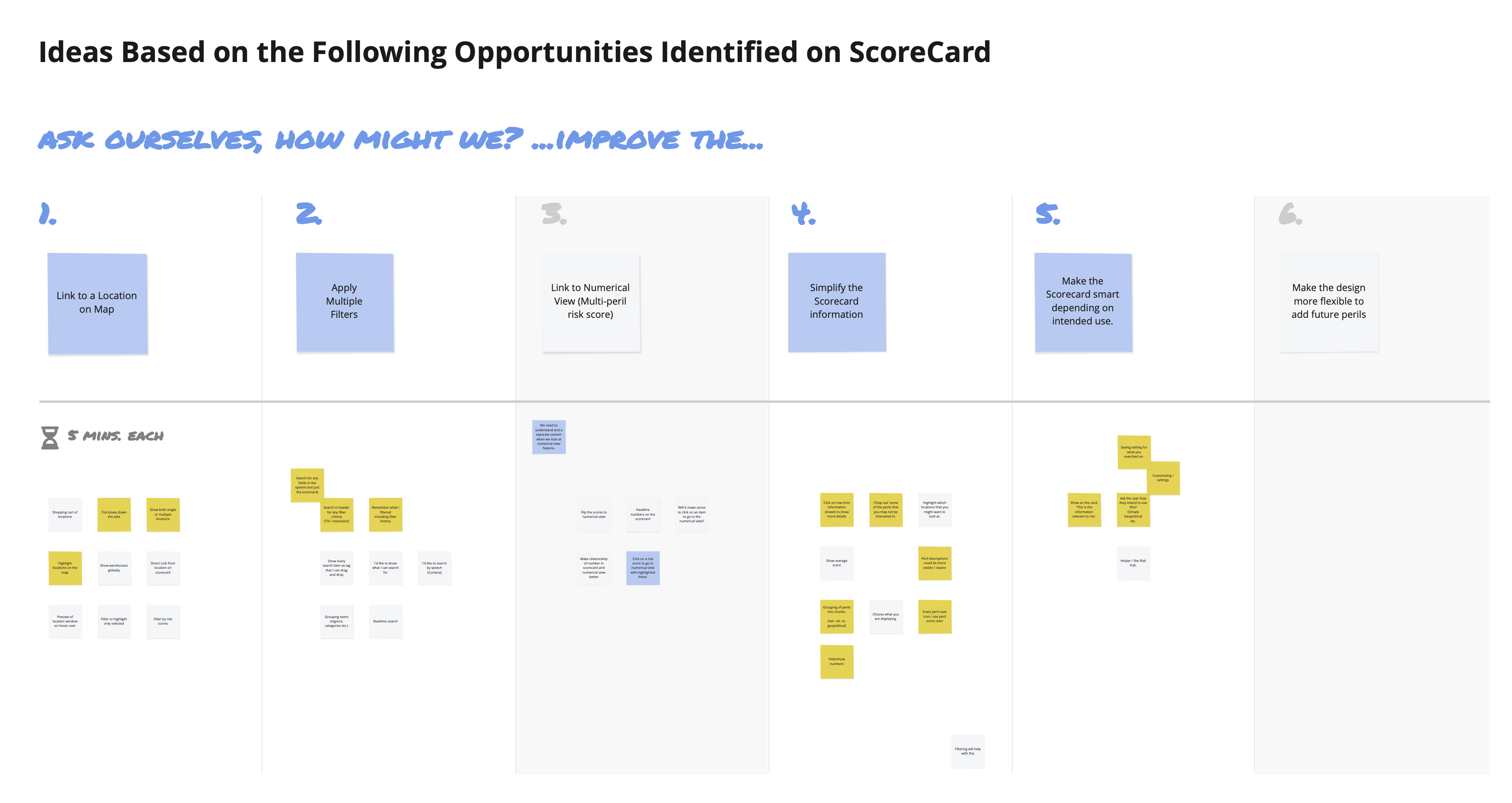
Dozens of sketches explored alternative layouts, filtering patterns, and interaction models.
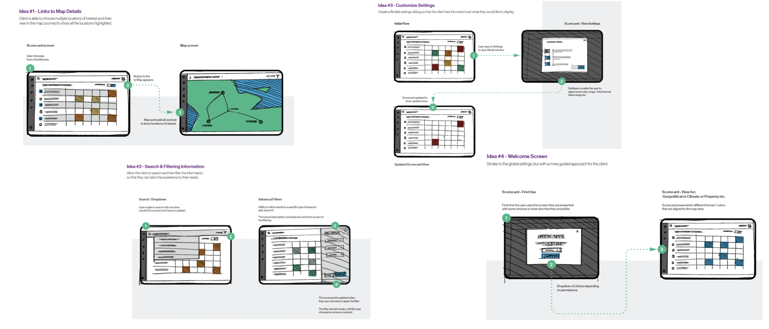
Concept Exploration
Each idea was visualised through quick wire concepts:
Idea #1 — Direct link from Scorecard to map details.
Idea #2 — Advanced search and multi-filter capability.
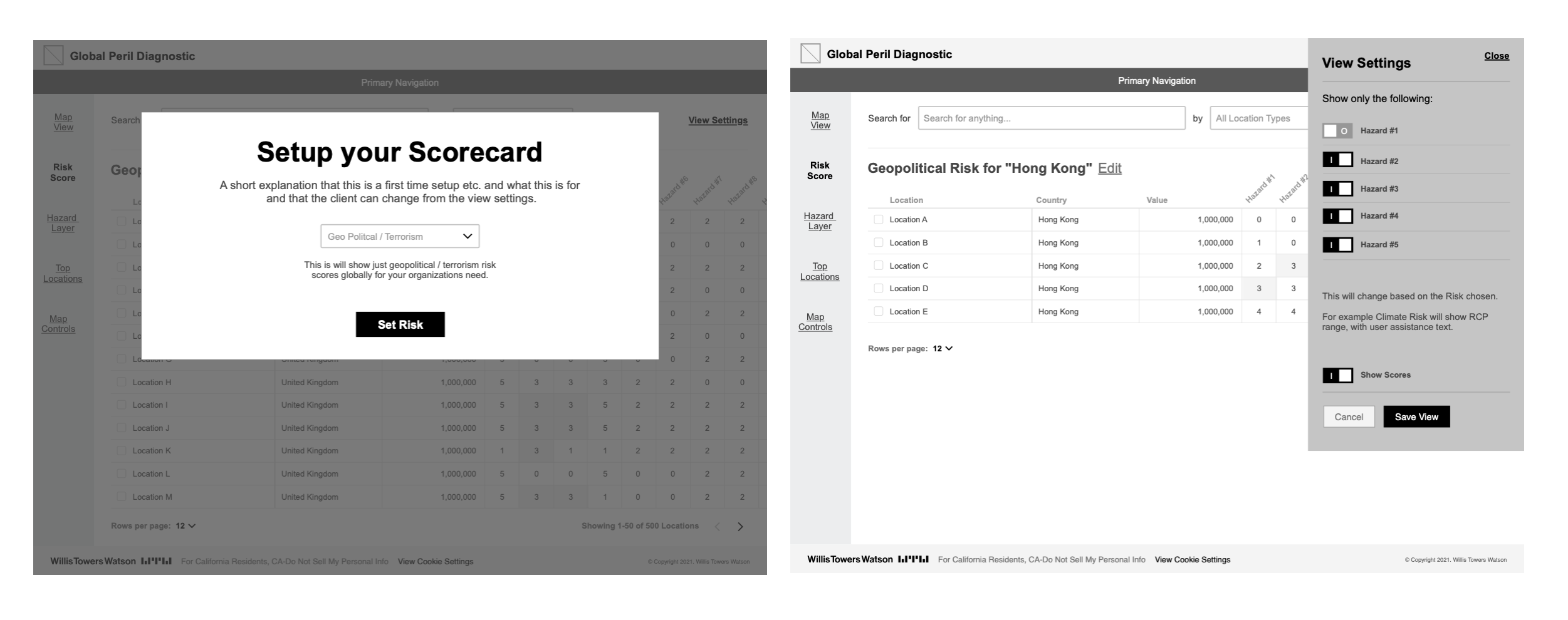
Idea #3 — Flexible settings for personalisation and control.
Idea #4 — First-use guidance and onboarding.
Mid-Fidelity Wireframes
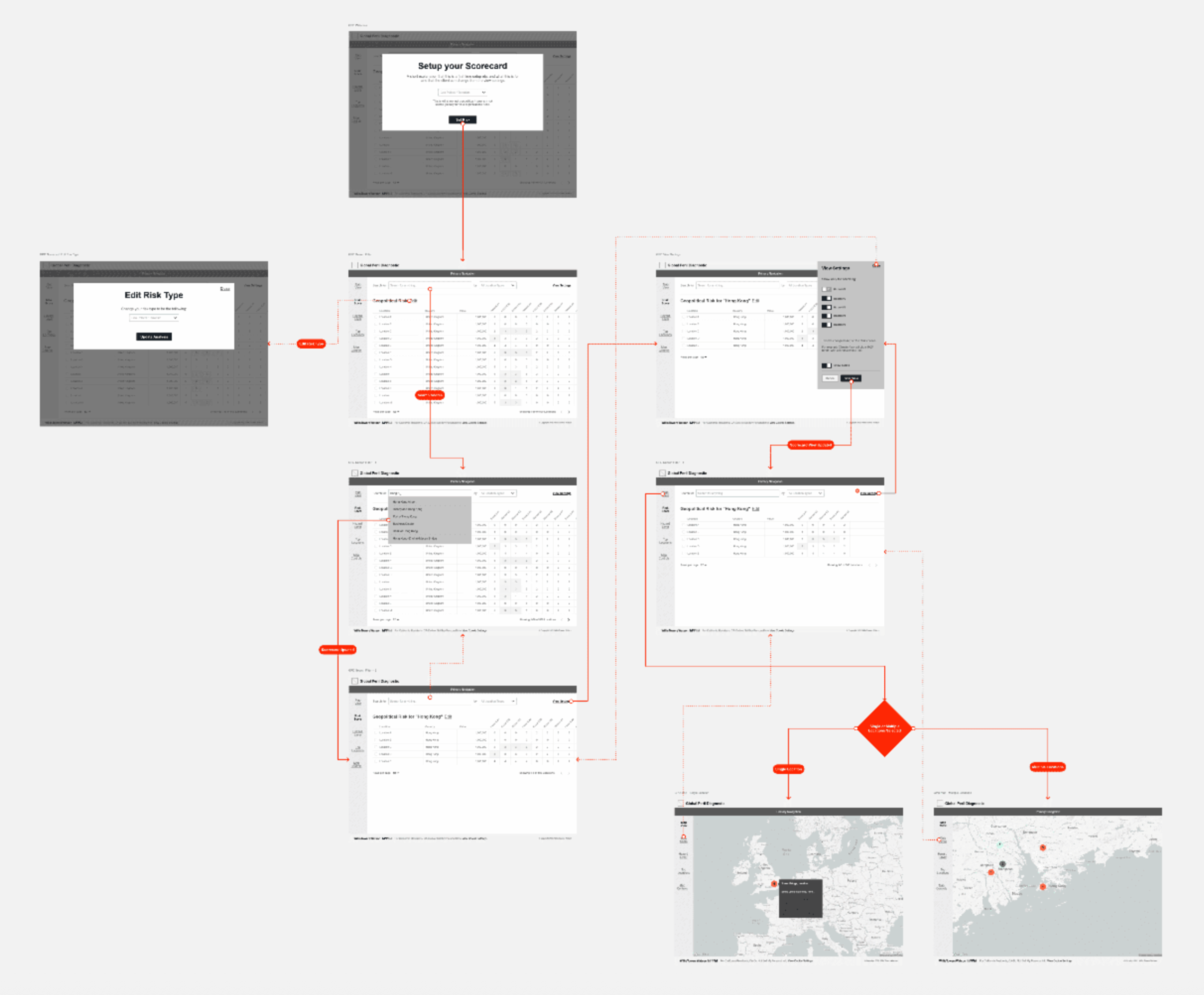
Consolidated mid-fidelity wireframes aligned across map, data, and scorecard modules.
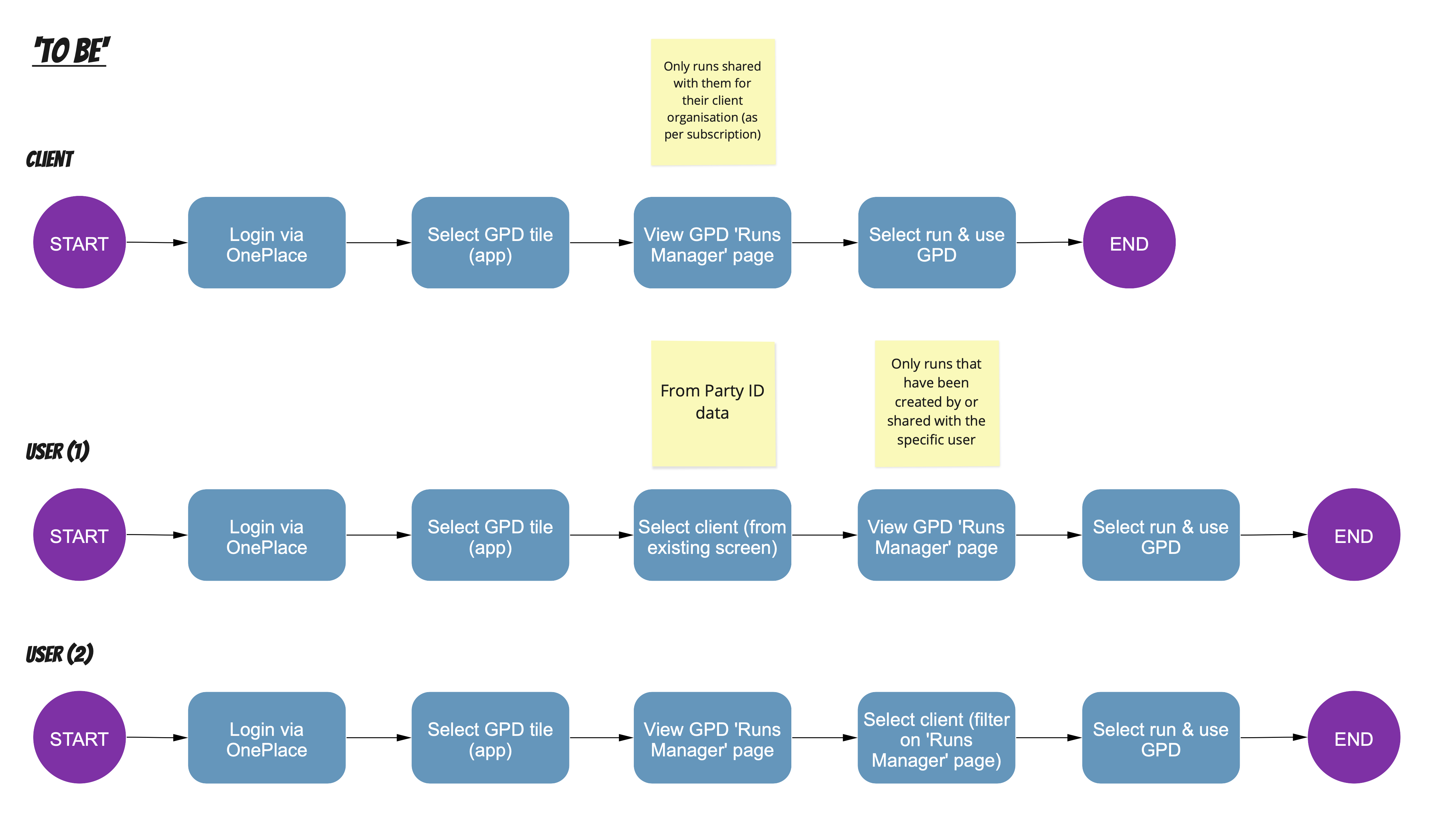
User Journey Redesigns
I then defined new end-to-end flows reflecting how users actually worked.
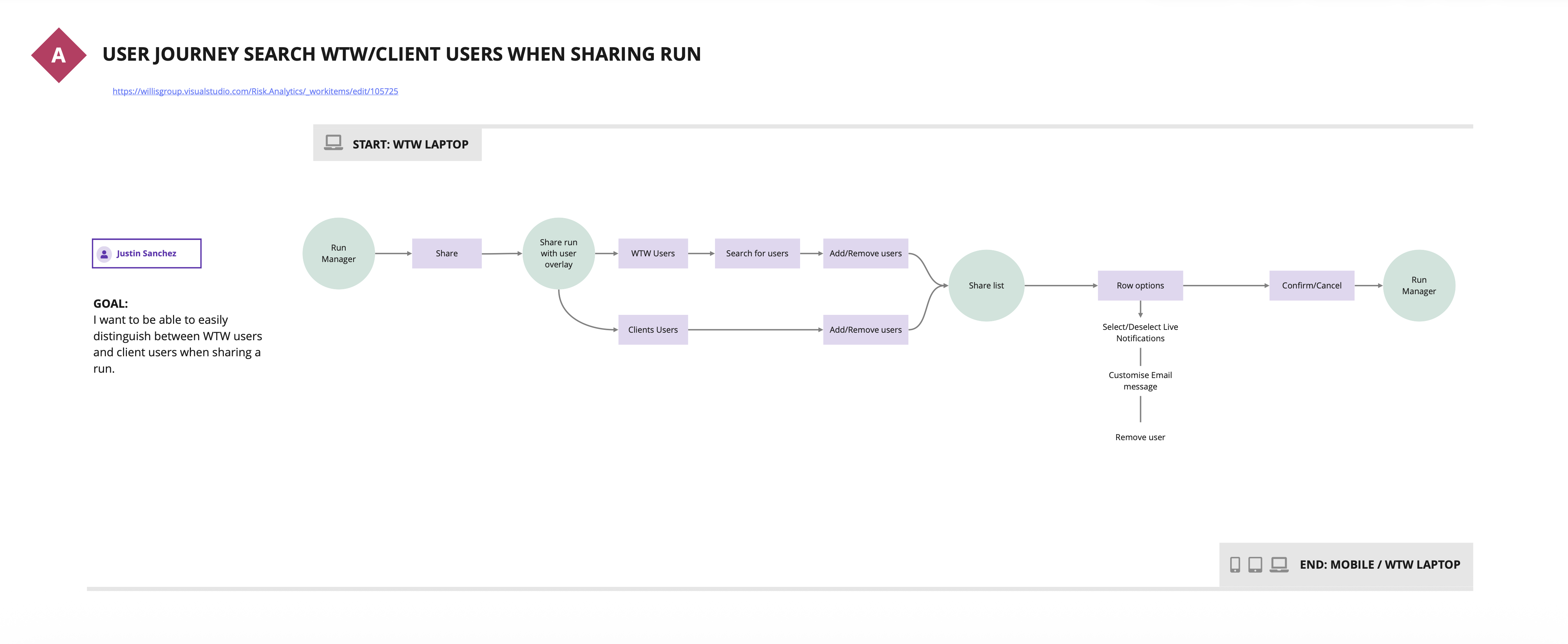
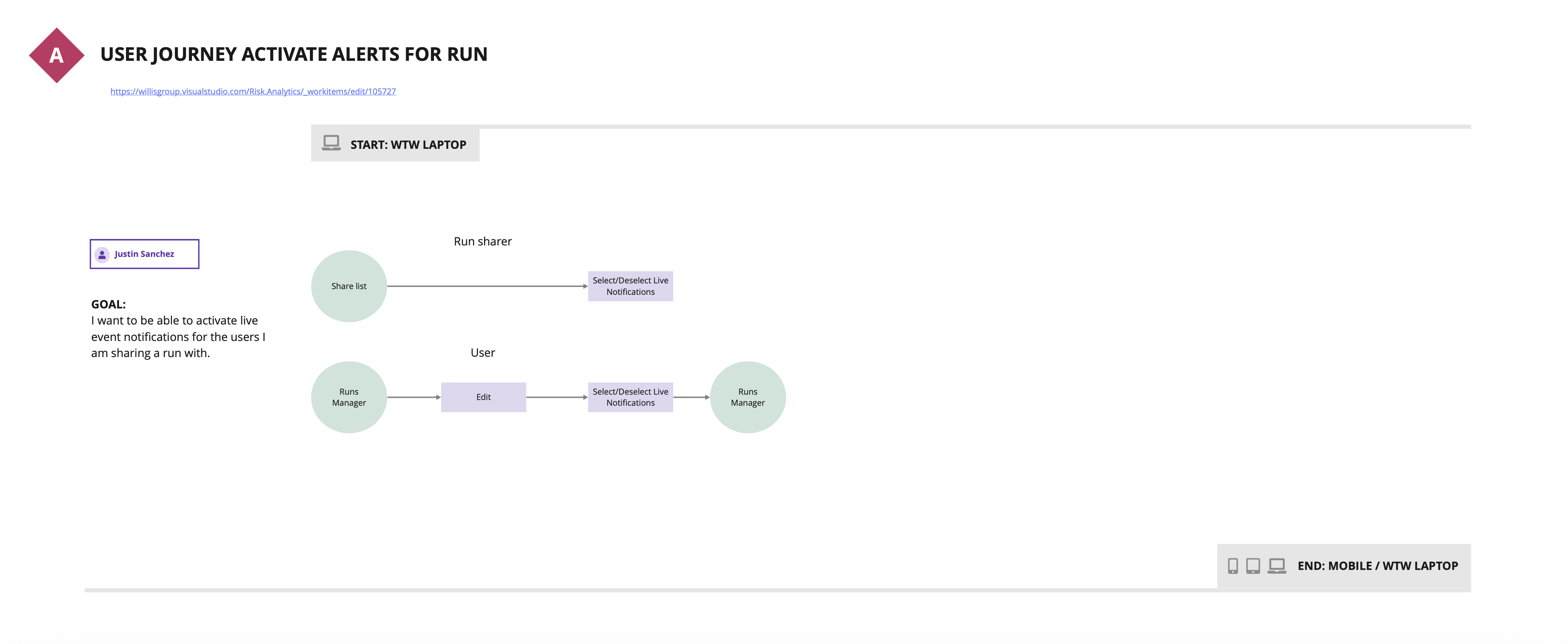
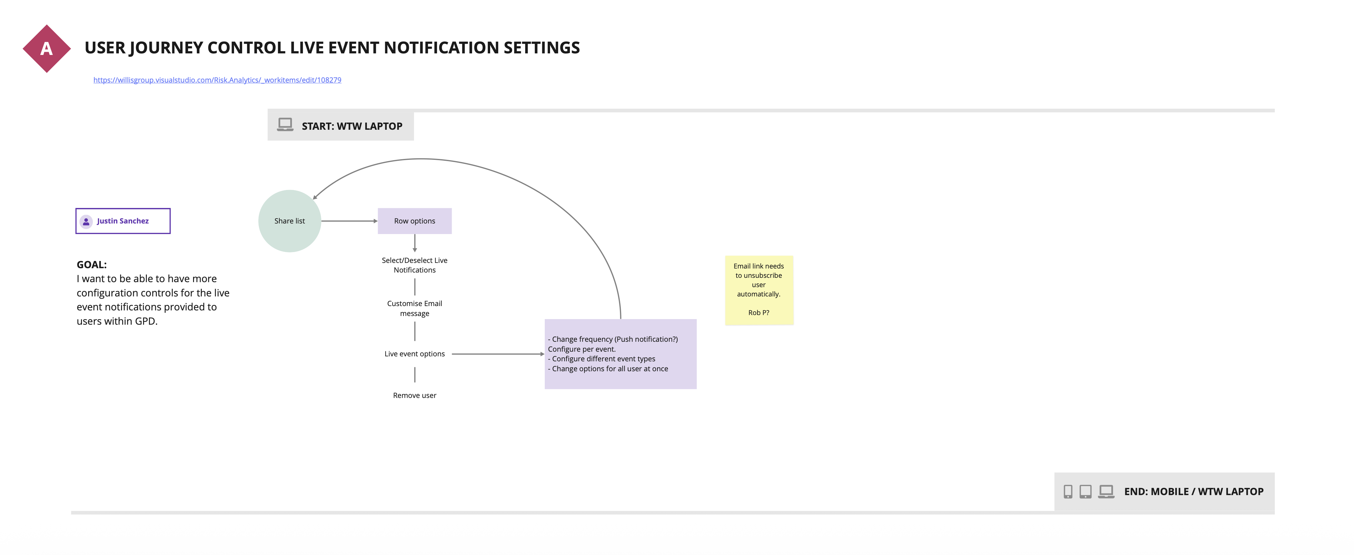
Each flow simplified navigation, clarified ownership, and aligned terminology.
The Solution
From “As-Is” to “To-Be”
The redesigned experience unified the product into a single, logical workflow.
Key Improvements
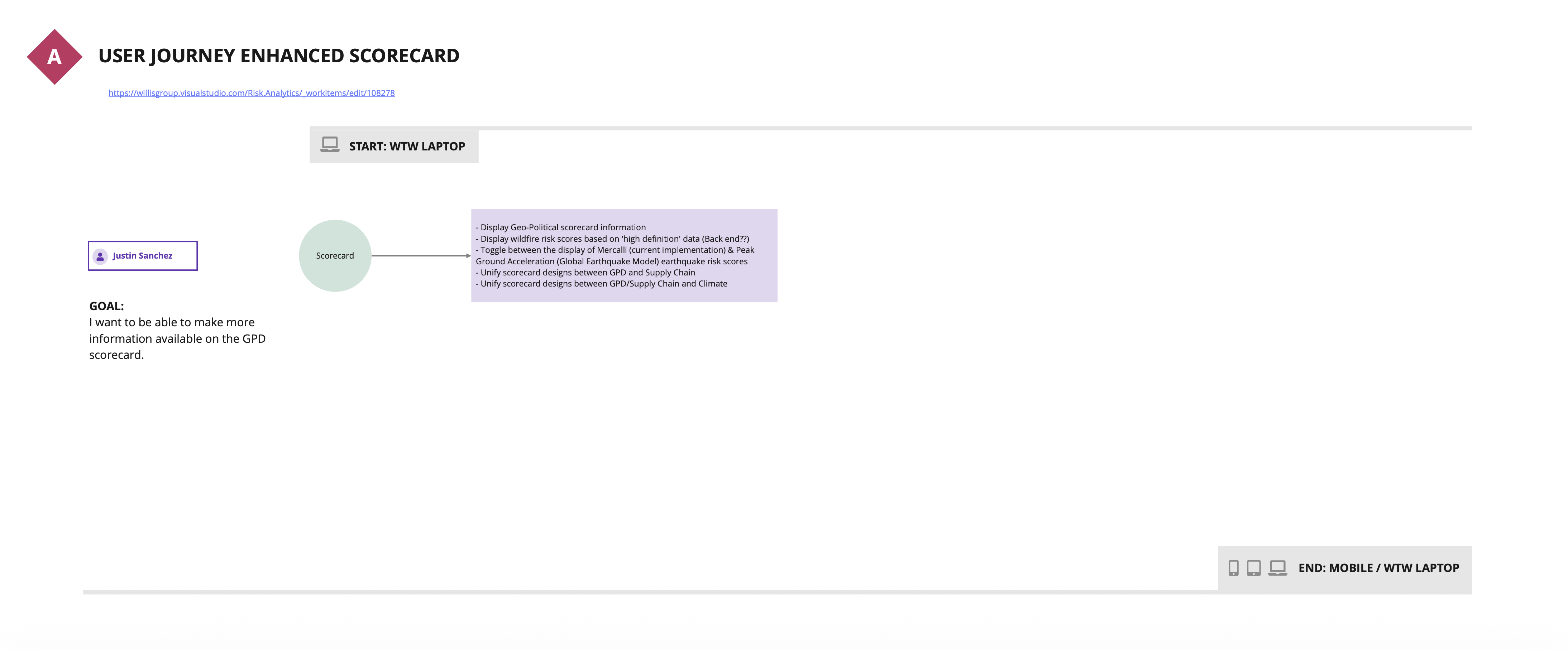
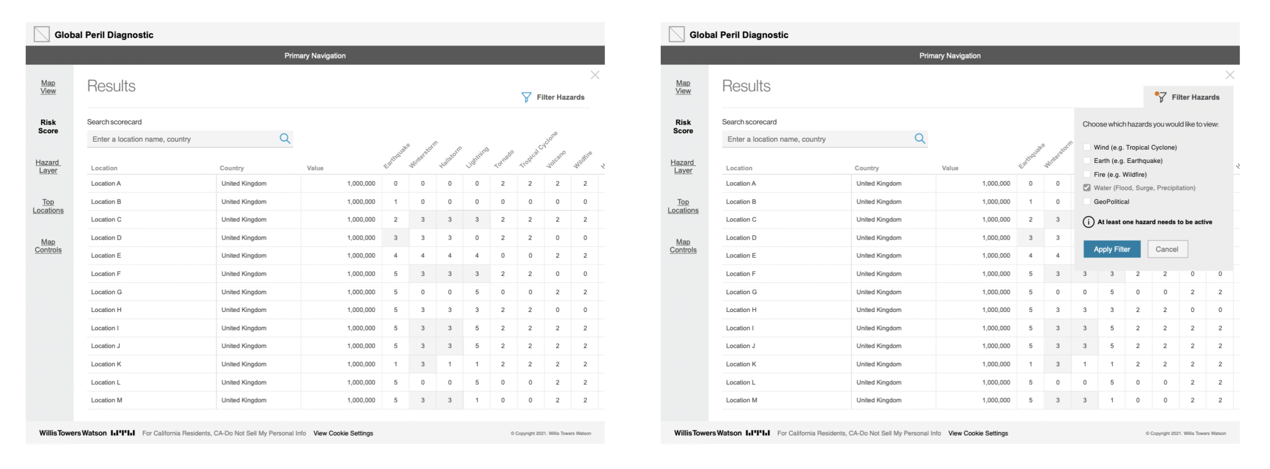
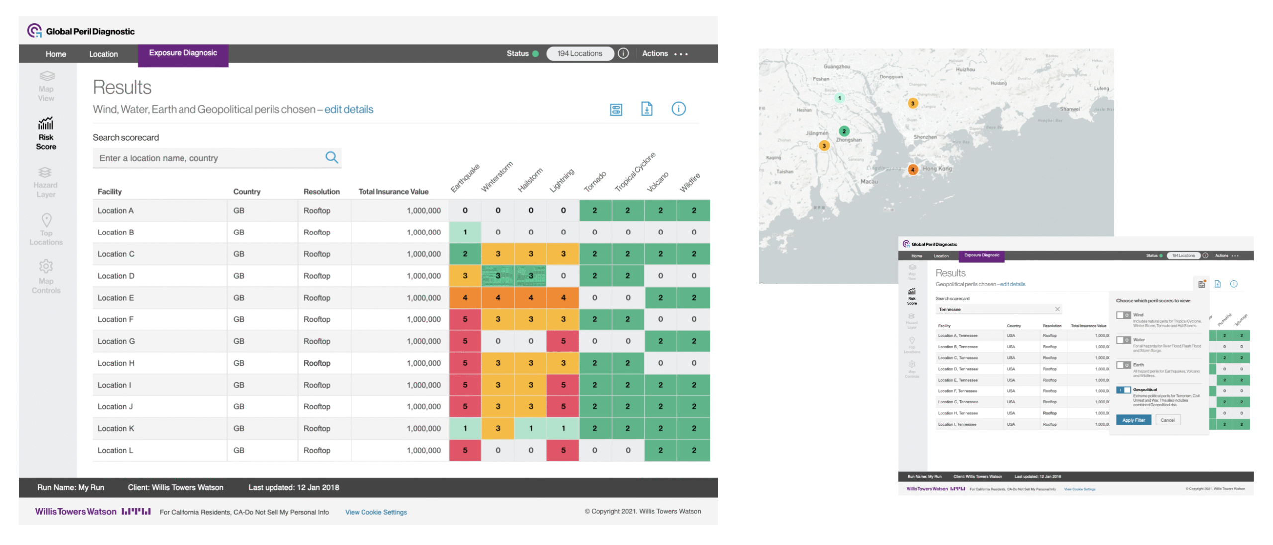
- Unified Scorecard Architecture – single view linking map, data, and narrative.
- Responsive Framework – adaptive design for analysts and clients.
- Enhanced Filtering & Sorting – persistent filters across modules.
- Improved Accessibility – WCAG 2.2 AA contrast and keyboard support.
- Contextual Insights – inline “Why this score?” explanations.
Testing & Validation
The improved prototype was tested with both WTW consultants and client analysts.
Scorecard Interaction
Testing showed:
- 60% reduction in navigation steps
- 40% faster task completion
- 30% increase in satisfaction (SUS survey)
Outcomes & Impact
The redesign delivered measurable improvements across performance, usability, and efficiency:
- Average task time dropped from 5 minutes 20 seconds to 3 minutes 05 seconds, a 42% reduction in effort per task.
- Navigation error rate fell from 28% to 9%, representing a 68% improvement in accuracy.
- Support queries decreased from 62 to 27 per quarter, a 56% reduction in reported issues.
Together, these outcomes reflect a major shift in how users interact with GPD — faster, clearer, and more confident decision-making across the platform.
- Adoption: Self-service use increased among non-consultant users.
- Consistency: Design language extended across related products (Climate Diagnostic, Supply Chain Diagnostic).
- Scalability: Framework prepared for AI-assisted risk insight features.
Cross-module usability improvements and functional alignment post-launch.
Final Outcome
The final design unified map, data, and narrative into a single, seamless experience. What was once a dense technical tool evolved into a clear, story-driven platform that helps users understand risk at a glance and act with confidence.
The new scorecard presents complex peril data in a clean, visual format that’s easy to scan and interpret. Map layers were redesigned with accessible colour palettes and consistent interaction patterns, while the numerical view now follows a clear hierarchy and adapts fluidly across screen sizes. The map and data views work together responsively, allowing users to explore patterns without losing context.
Finally, refined terminology, contextual event indicators, and simplified navigation give the GPD a sense of precision and composure — turning complexity into clarity for every user.
Reflection & Learnings
- Design for transparency. Risk models must show how scores are calculated — clarity builds trust.
- Empower the user. Reducing consultant dependency increases adoption.
- Align data and design early. Collaboration with analytics teams was critical to avoid rework.
- Prototype fast, validate early. Interactive HTML prototypes accelerated stakeholder buy-in.