Background & Context
Willis Towers Watson is a global leader in risk analytics. Their Global Peril Diagnostic platform gives consultants and clients a way to evaluate exposure across portfolios covering natural catastrophe, political risk, and supply chain disruption, so they can make decisions with confidence.
By the time I joined the project, the product had been growing for years without a coherent design foundation underneath it. Different teams had built different modules, each with its own UI logic, terminology, and interaction patterns. The result was a platform that worked technically, but was increasingly difficult to use, maintain, and extend.
The brief was to redesign the experience. But early on it became clear that redesigning screens without fixing what was underneath them would only push the problem further down the road.
The Challenge
Discovery confirmed what the product looked like from the outside: fragmented workflows, inconsistent data visualisation, and a heuristic evaluation full of accessibility and usability failures.
But the more significant finding was structural. Design and development had no shared language. There were no reusable components, no agreed tokens, no documentation that both sides could work from. Every new feature was being built from scratch, which meant inconsistencies multiplied with every release and QA cycles were long and unpredictable.
The UX problems were real. But they were symptoms. The root cause was that nobody had ever built a proper foundation for this product to grow from.
The Approach
I proposed running the redesign and a design system build in parallel, not as two separate workstreams, but as one connected effort.
The reasoning was straightforward. If we redesigned the UI without a system behind it, we would hand developers a set of polished screens with no shared infrastructure to build from. The inconsistencies would return within a release cycle.
Getting buy-in took some work. The design system felt like additional scope to stakeholders who were focused on shipping. The case I made was about efficiency and risk. Building the system now would reduce QA overhead, accelerate future development, and make the redesign extensible to the related products already on the roadmap: Climate Diagnostic and Supply Chain Diagnostic.
Once that framing landed, the system work became part of the brief rather than a bolt-on.
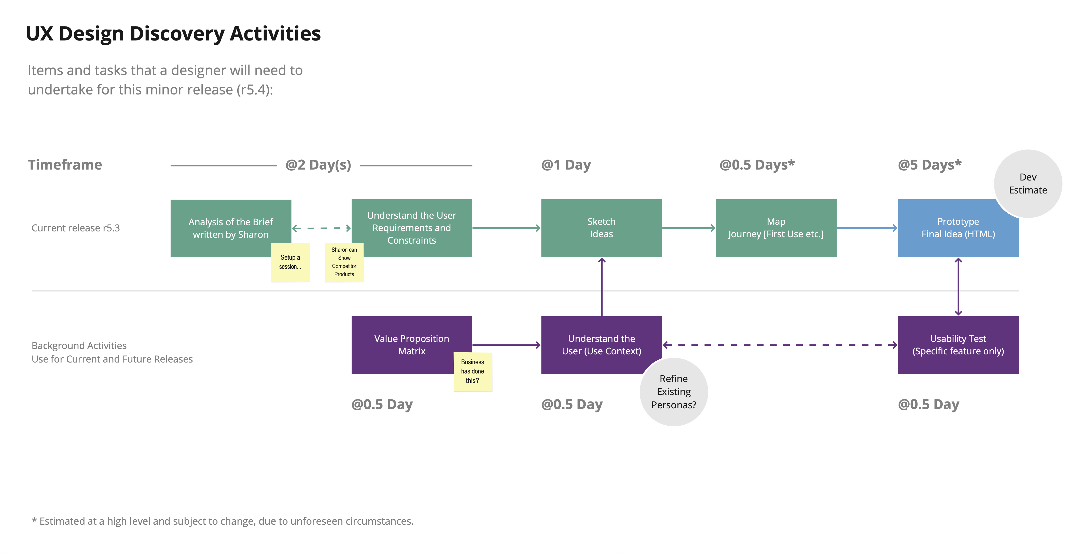
Discovery
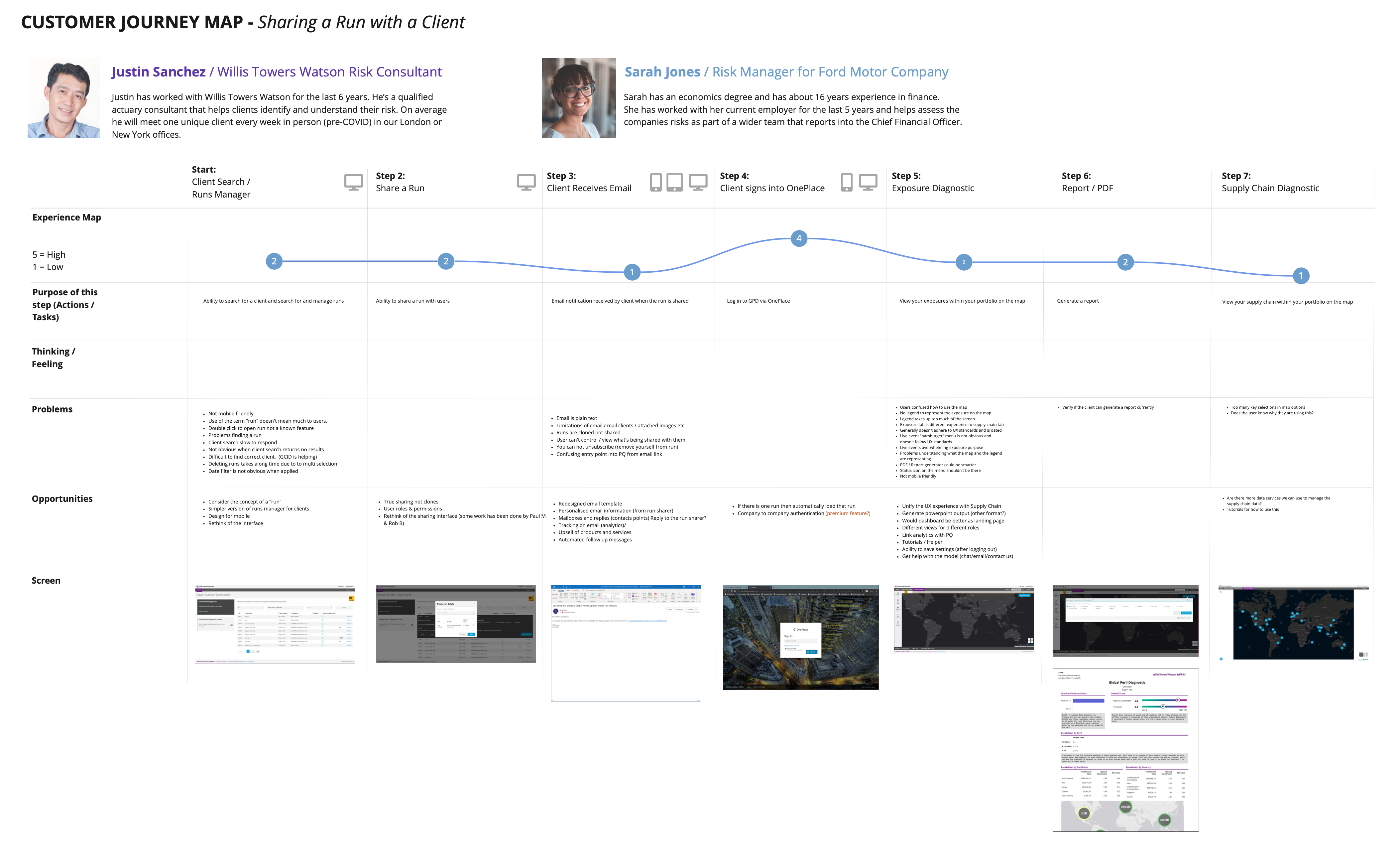
I started with structured discovery covering stakeholder mapping across product, analytics, IT, and consulting, user interviews with both WTW consultants and client analysts, and a full audit of the existing platform.
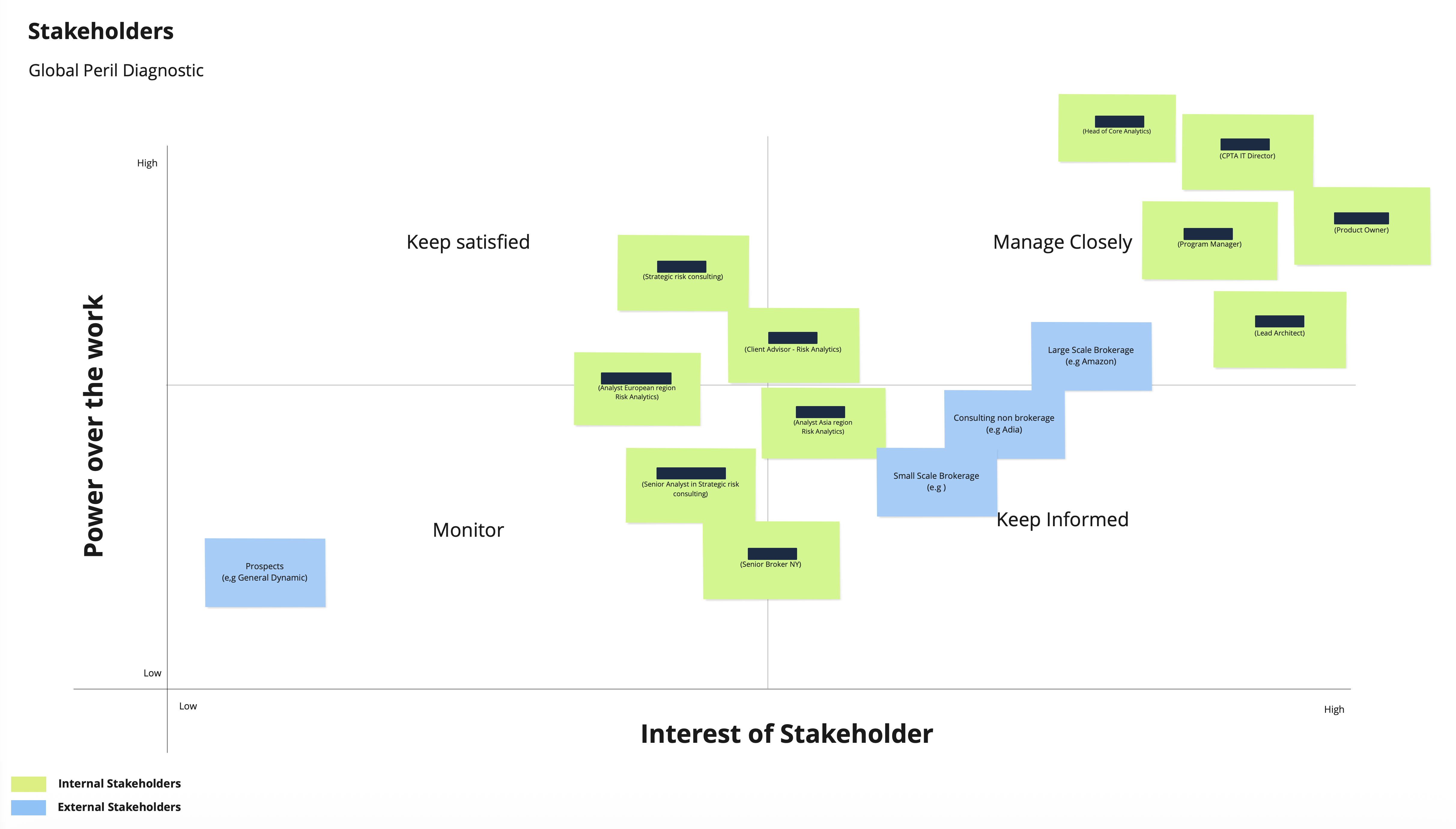
The audit surfaced the scale of the problem. Modules had been built independently with different colour logic, different filtering patterns, and different terminology for the same concepts. Users were switching between portals and spreadsheets to complete tasks that should have lived in one place. Permissions and run management were confusing enough that consultants were regularly fielding questions that the product itself should have answered.
The heuristic evaluation gave us a structured baseline: overloaded controls, poor feedback states, contrast failures, and layouts that broke on anything smaller than a wide desktop monitor.
That baseline mattered, not just as a diagnostic but as a tool for stakeholder alignment. It gave us an objective way to prioritise and make the case for the scope of work ahead.
Defining the Opportunity
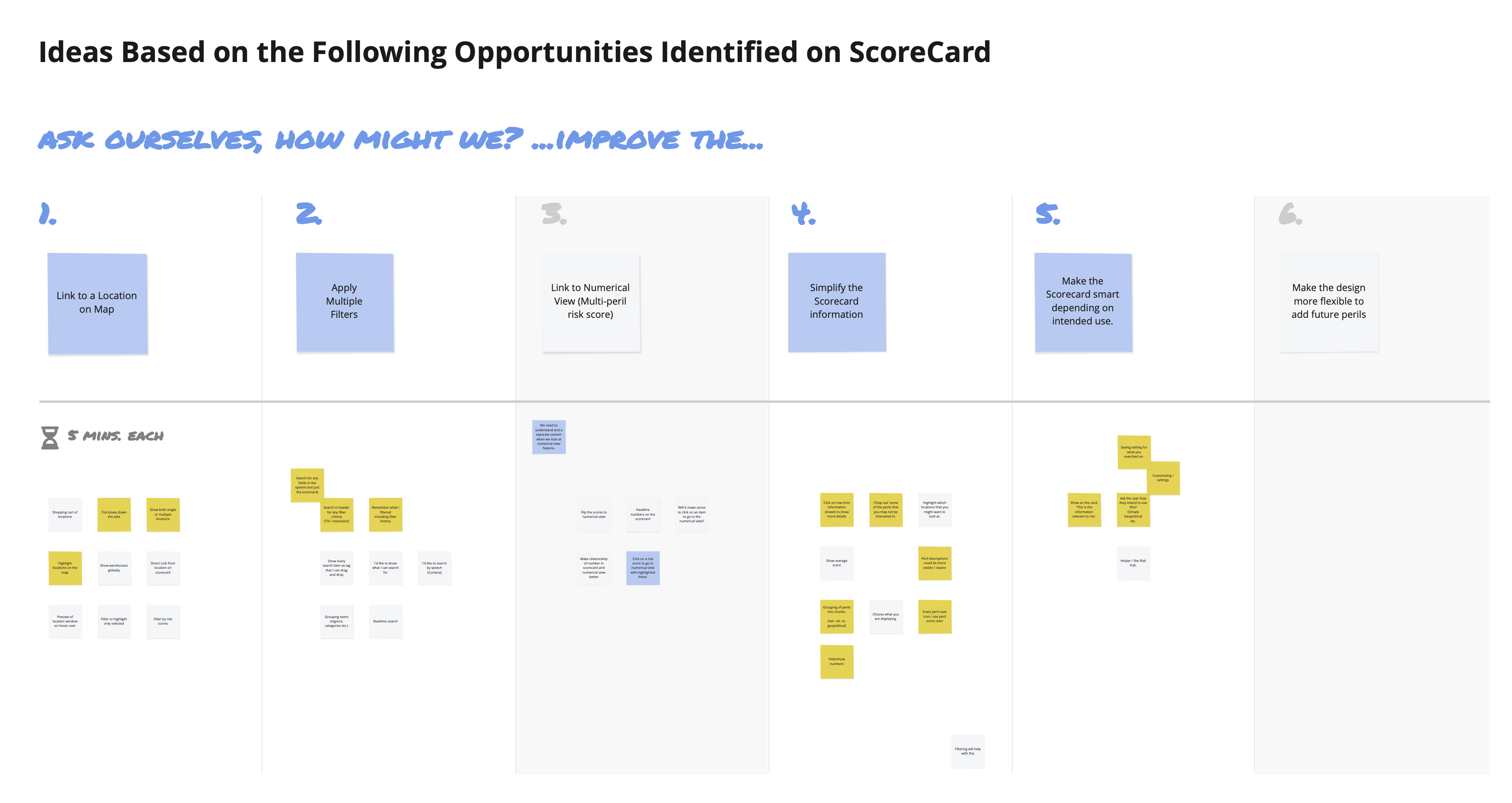
With the audit complete, I facilitated an ideation workshop with consultants and analysts to move from diagnosis to direction. Problem statements were reframed as design opportunities. How might we make risk scores legible at a glance? How might we give users confidence in what they are sharing and with whom? How might we reduce the steps between analysis and action?
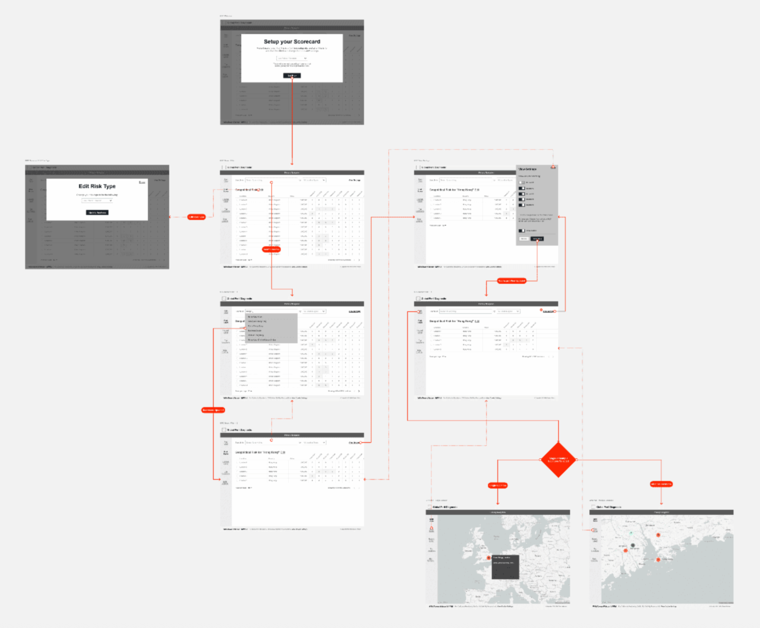
Four clear opportunity areas came out of that session: direct navigation from scorecard to map detail, advanced filtering and search, personalisation and user control, and first-use onboarding for less experienced users.
Each was worth exploring. Not all made it through to the final solution, and that filtering process was as important as the ideas themselves.
The Design System Work
Alongside the UX redesign, I built the component and token framework that would underpin it.
The goal was not to build a comprehensive system in isolation. It was to build it in lockstep with the redesign, so that every decision made about the UI was immediately reflected in reusable, documented components that developers could work from.
This changed the relationship between design and development in a practical way. Handoff became less about interpreting static screens and more about implementing agreed components. QA became faster because there was a shared reference point. When new features were needed, there was a foundation to build from rather than starting from scratch each time.
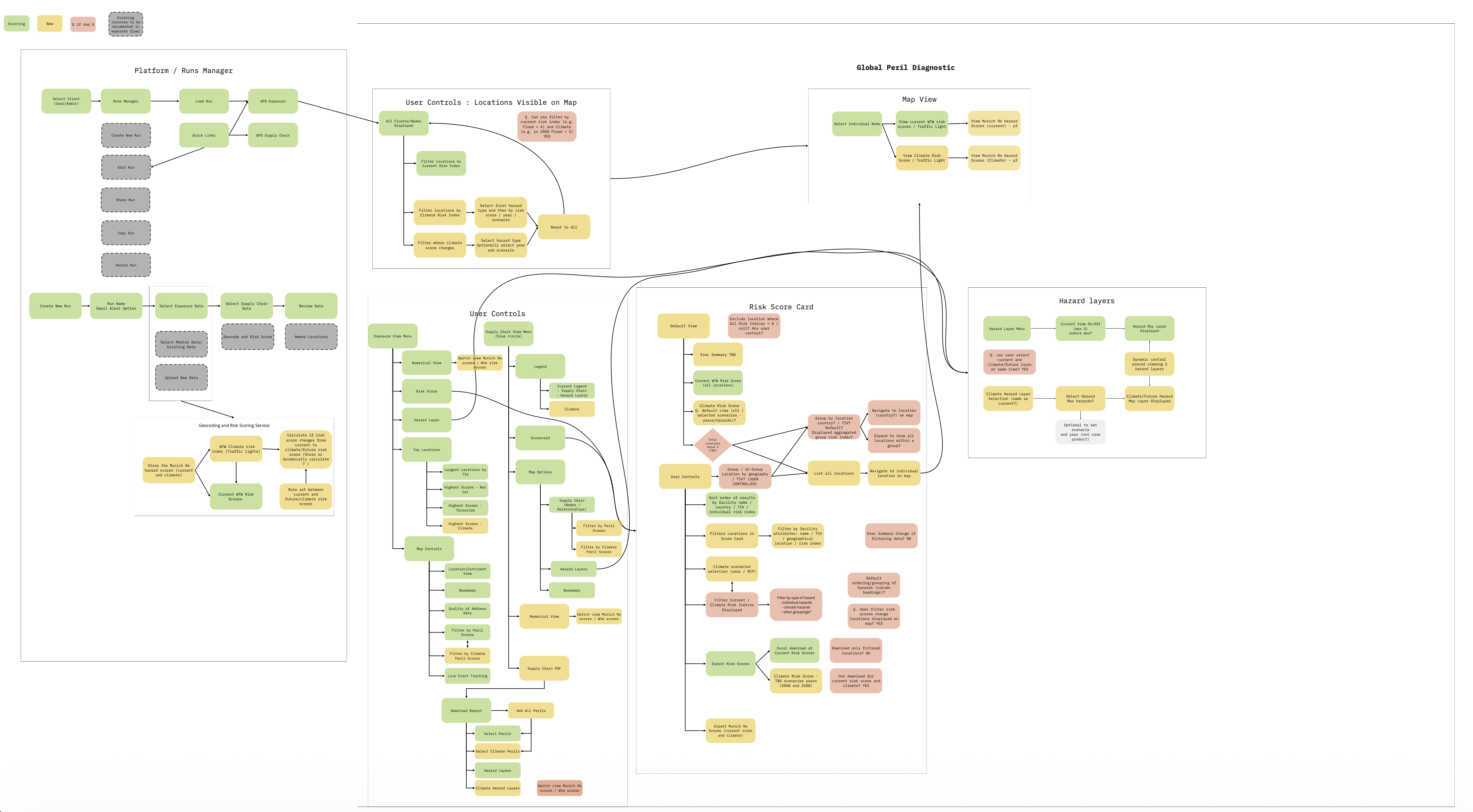
The Solution
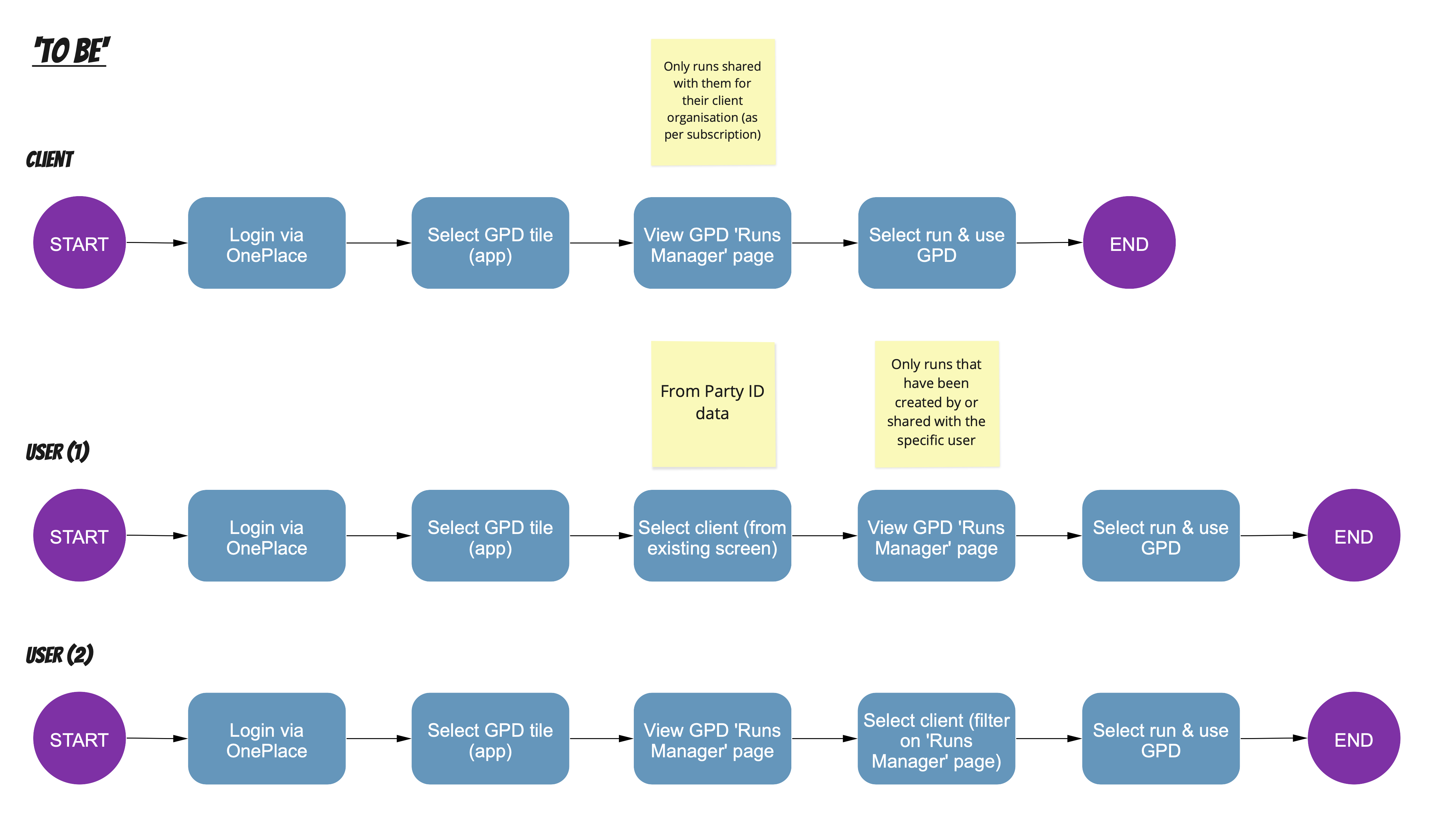
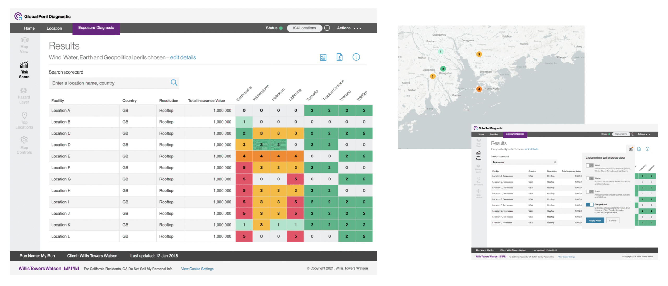
The redesigned GPD unified map, data, and scorecard into a single coherent experience.
The scorecard became the central view, a single place where risk scores, map context, and narrative explanation sat together. Users no longer needed to navigate between modules to understand a result.
Map layers were rebuilt with an accessible colour palette and consistent interaction logic. Contrast issues were resolved to meet WCAG 2.2 AA. Controls were consolidated and labelled clearly.
The numerical view was restructured with a clear hierarchy and responsive layout, making large datasets readable across screen sizes.
Filtering and sorting became persistent across modules. It sounds like a small change but in practice it significantly reduced the cognitive overhead of moving through the platform.
Terminology was standardised across the product, which meant users and consultants were finally working from the same language.
Outcomes
Internal usability testing showed meaningful improvements in task completion time and navigation accuracy. Support queries to the consulting team dropped noticeably as users started finding answers in the product rather than asking for help.
More significantly, the design system extended beyond GPD. The component framework and design language were adopted by the Climate Diagnostic and Supply Chain Diagnostic products, both of which had been on the roadmap throughout and had shaped the scope of the system work from the start. What began as a foundation for one product became infrastructure for a family of them.
Reflection
The most useful decision on this project was not a UX decision. It was a scoping decision. Identifying that the design system needed to happen alongside the redesign, making the case for it, and keeping both workstreams coherent while the product continued to evolve was the work that made the rest of it last.
The hardest part was not building the system. It was getting development teams involved early enough that the system felt like a shared resource rather than a design deliverable handed over the fence. The projects that followed were faster and more consistent because of that early investment in alignment.